# Object Presentation
> Symcon documentation · English · generated on 2026-09-26
> Index: https://www.symcon.de/en/llms.txt
Source: https://www.symcon.de/en/service/documentation/components/object-presentation/
### Active Elements
Individual switchable elements can be presented in different ways.
### Passive Elements
Individual elements that cannot be switched have different presentations.
### Events
Allows the execution of logic, depending on date and time or the update of other objects.
### External Elements
External files like [Media](https://www.symcon.de/en/service/documentation/basics/media) can be displayed within the visualization.
### Summarized Presentations
Multiple elements can be summarized intelligently to a single presentation.
### Legacy-Presentations
These are outdated presentations which redirect to their actual presentations.
## Enumeration
Source: https://www.symcon.de/en/service/documentation/components/object-presentation/enumeration/
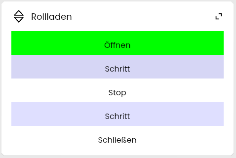
An Enumeration is a list of values that can be selected.
### Requirements
An Enumeration is a [Variable](../concepts.md) with the [presentation](../concepts.md) Enumeration. To use this presentation, the variable must fulfill the following conditions:
* configured [Variable action](../concepts.md)
#### Parameter
| Parameter | Description |
| ------------ | ----------------------------------------------------------------------------------------------------------------------------------------------------------------------------------------------------------------------------------------------------------------- |
| Default Icon | The [Icon](icons.md) used for the variable |
| Options | The individual [Options](https://www.symcon.de/./#Options) of the enumeration |
| Layout | The layout of the options in a tile. Possible layouts are Column, Row, and Grid. Grid is not available for variables of type Boolean. This parameter is only evaluated for [appearance as own tile](https://www.symcon.de/./#As_own_Tile), not for appearance within a list. |
| Display... | The displayed content for each option. "Caption", "Icon", and "Caption and Icon" can be selected. (since Symcon 8.2) |
##### Options
| Parameter | Description |
| -------------- | -------------------------------------------------------------------------------------------------------------- |
| Value | The option is applied for this variable value |
| Label | Text displayed for this option |
| Overwrite icon | If set, the default icon for this presentation is overwritten if the variable has the value of this option |
| Icon | Icon for the variable if the variable has the value of this option (only available if "Overwrite icon" is set) |
| Color | Color that is used to display this option inside the enumeration |
### Display as legacy profile
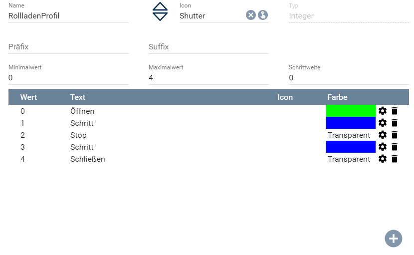
If a variable uses the presentation [Legacy profile](object-presentation.md), it is displayed as an Enumeration if it also fulfills the following conditions:
* [Variable profile](../concepts.md) with the following parameters:
* step size to 0 (only for integer/float, otherwise no option for step size)
* at least 1 association set
* minimum value and maximum value irrelevant
### Appearance in Tile Visualization
#### As own Tile
#### Within a List

### Appearance in the WebFront

## Trigger Event
Source: https://www.symcon.de/en/service/documentation/components/object-presentation/trigger-event/
_Requires Symcon >= 7.0_
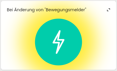
A triggered event can be activated or deactivated in the visualization.
#### Requirements
A triggered event is a [Event](../concepts.md) of the type [Trigger](../concepts.md).
### Appearance in Tile Visualization
#### As own Tile
#### Within a List

### Appearance in the WebFront
Trigger events are not displayed in the WebFront.
## Automation
Source: https://www.symcon.de/en/service/documentation/components/object-presentation/automation/
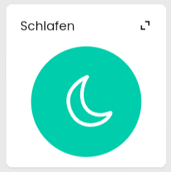
Automations can be executed via a button.
#### Requirements
A configured [Automation](../concepts/automations.md) can be executed in the visualization
> **Note:** In the display as a separate tile, the icon of the button is based on the [Icon](icons.md) of the Automation
### Appearance in Tile Visualization
#### As own Tile
#### Within a List

### Appearance in the WebFront

## Image
Source: https://www.symcon.de/en/service/documentation/components/object-presentation/image/
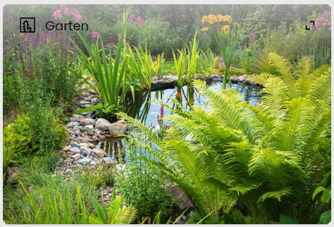
Any images can be integrated into the visualization.
#### Requirements
An Image is a [Medium](../concepts.md) of type [Image](../concepts.md).
### Appearance in Tile Visualization
#### As own Tile
#### Within a List

### Appearance in the WebFront
## Date/Time
Source: https://www.symcon.de/en/service/documentation/components/object-presentation/datetime/
_Requires Symcon >= 4.1_
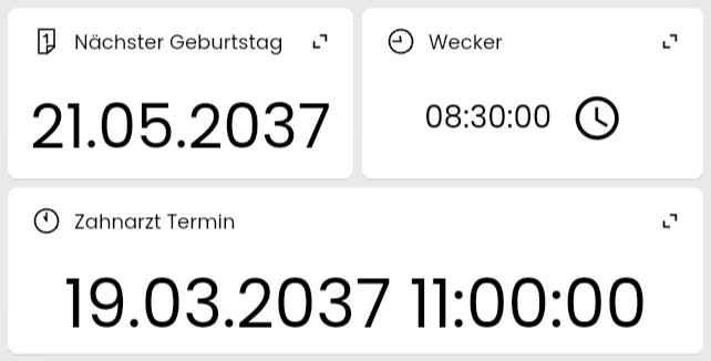
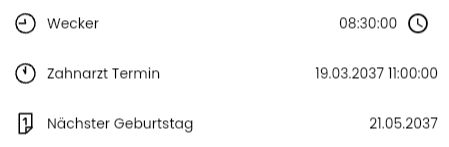
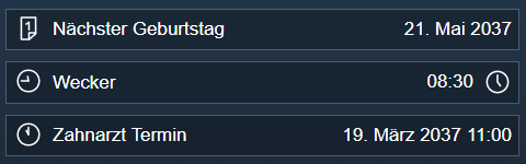
With Date/Time, a point in time can be displayed and adjusted if necessary.
#### Requirements
A Date/Time is a [variable](../concepts.md) with the [presentation](../concepts.md) Date/Time. To use this presentation, the variable must fulfill the following conditions:
* integer type
#### Parameter
| Parameters | Description |
| -------------------- | -------------------------------------------------------------------------------------------------------------------------------------- |
| Date Display | Determines how the date is formatted. Possible options are: "None", "Year, Month and Day", "Month and Day", and "Year and Month" |
| Format Month as | If the month is to be displayed in the date, its formatting can be adjusted. The following are possible: "Text" and "Number" |
| Show Day of the Week | Determines whether the day of the week is also displayed in the format |
| Time Display | Determines how the time should be formatted. The following are possible: "None", "‘Hours and Minutes" and "Hours, Minutes and Seconds" |
### Display as legacy profile
If a variable uses the presentation [Legacy profile](object-presentation.md), it is displayed as a date/time if one of the following [Variable profiles](../concepts.md) is selected:
* ~UnixTimestamp
* ~UnixTimestampDate
* ~UnixTimestampTime
The different profiles correspond to fixed parameter combinations.
#### ~UnixTimestamp
- Date Display: Year, Month and Day
- Format Month as: Text
- Show Day of Week: No
- Time Display: Hours and Minutes
#### ~UnixTimestampDate
- Show date: Year, Month and Day
- Format Month as: Text
- Show Day of the Week: No
- Show Time: None
#### ~UnixTimestampDate
- Date Display: None
- Time Display: Hour and Minutes
If the variable has a [variable action](../concepts.md), the time can be adjusted in the visualization
### Appearance in Tile Visualization
> **Note:** In the grid settings, the various displays can be configured separately as "Date", "Time" and "Date and Time"
#### As own Tile
#### Within a List
### Appearance in the WebFront
## Duration
Source: https://www.symcon.de/en/service/documentation/components/object-presentation/duration/
_Requires Symcon >= 8.0_
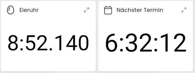
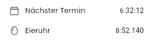
Duration can be used to format the time until/since a point in time or a simple value as a duration.
#### Requirements
Duration is a [variable](../concepts.md) with the [presentation](../concepts.md) duration. To use this presentation, the variable must fulfill the following conditions:
* type integer or float
* no configured [variable action](../concepts.md)
#### Parameter
| Parameter | Description |
| ----------------- | ------------------------------------------------------------------------------------------------------------------------------------------------------------------------------------------------------------------------------------------------------------------------------------------------------------------------ |
| Display Type | Defines how the displayed value is created.
**Value in variable:** The duration in seconds which should be formatted
**Duration until value in variable:** The duration until the time coded as a Unix timestamp
**Duration since value in variable:** The duration since the time coded as a Unix timestamp |
| Format | The format for in which the duration is formatted. The following are possible: "seconds only", "minutes and seconds", and "hours, minutes and seconds" |
| Show Milliseconds | Determines whether milliseconds should also be displayed |
> **Note:** If the display type includes a point in time, the displayed value is updated automatically.
### Appearance in tile visualization
#### As own tile
#### Within a list
### Appearance in the WebFront
This display is not supported by the WebFront. Instead, the unformatted value of the variable is displayed.
## Chart
Source: https://www.symcon.de/en/service/documentation/components/object-presentation/chart/
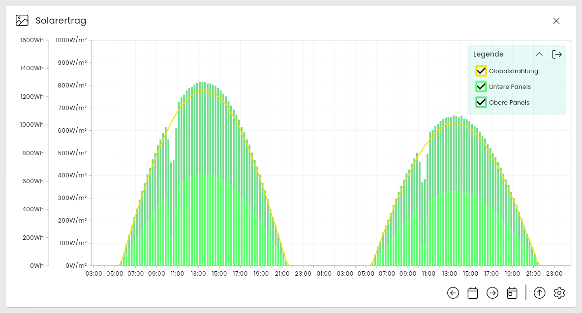
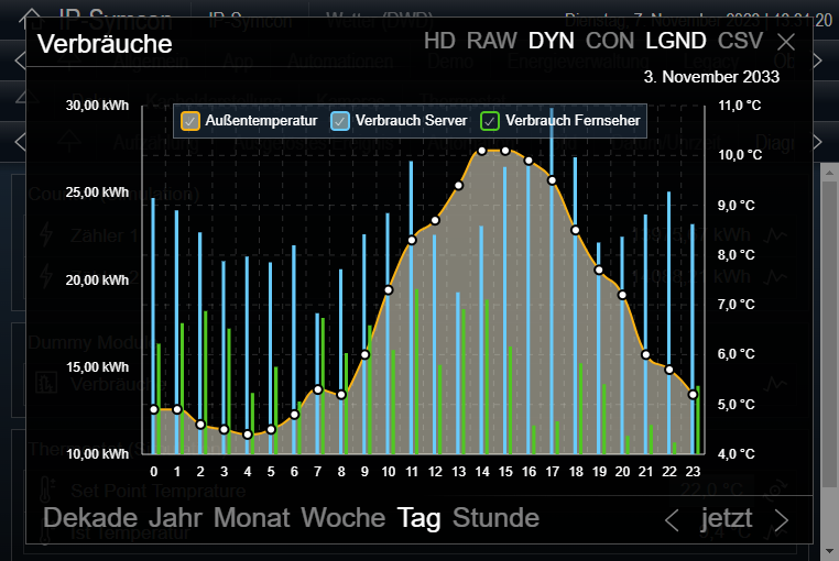
The course of several variables can be displayed in a Chart.
[Video](https://www.youtube.com/embed/W64WqjSUEWA?rel=0&cc_load_policy=1)
#### Requirements
A chart is a [Medium](../concepts.md) of the type [Chart](../concepts.md).
### Appearance in Tile Visualization
#### As own Tile
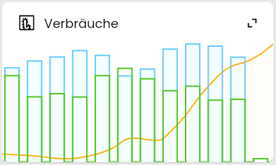
> **Note:** If a Tile is sufficiently large, it is displayed analogous to the fullscreen display instead
#### In Fullscreen
#### Within a List

### Appearance in the WebFront

## Document
Source: https://www.symcon.de/en/service/documentation/components/object-presentation/document/
A Document can be downloaded by selecting the button.
#### Requirements
A Document is a [Medium](../concepts.md) of type [Document](../concepts.md).
### Appearance in Tile Visualization
#### As own Tile
#### Within a List

### Appearance in the WebFront

## Single Element
Source: https://www.symcon.de/en/service/documentation/components/object-presentation/single-element/
_Requires Symcon >= 7.0_
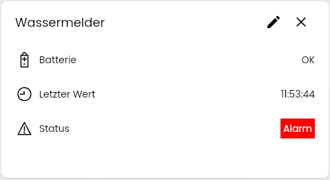
Enables the display of an element from a List as a single tile.
#### Requirements
Each [Instance](../concepts.md) can be displayed as a Single Element. The presentation is automatically selected if an instance only has one sub-object. Alternatively, it can be selected for each instance with multiple objects via "[Edit Tiles](tile-visualization.md)".
### Appearance in Tile Visualization
#### As own Tile
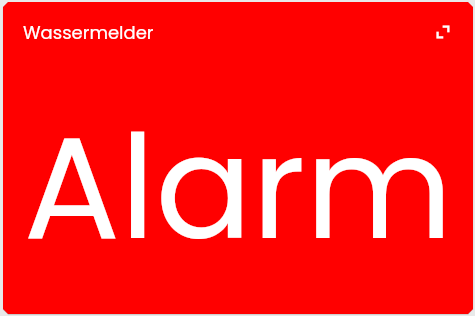
If the Tile is opened, all objects of the instance are displayed as [List](object-presentation.md).
### Appearance in the WebFront
This display is not supported by the WebFront. Instead, the instance is displayed as [List](object-presentation.md).
## Energy Manager
Source: https://www.symcon.de/en/service/documentation/components/object-presentation/energy-manager/
_Requires Symcon >= 7.0_
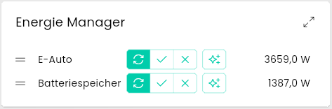
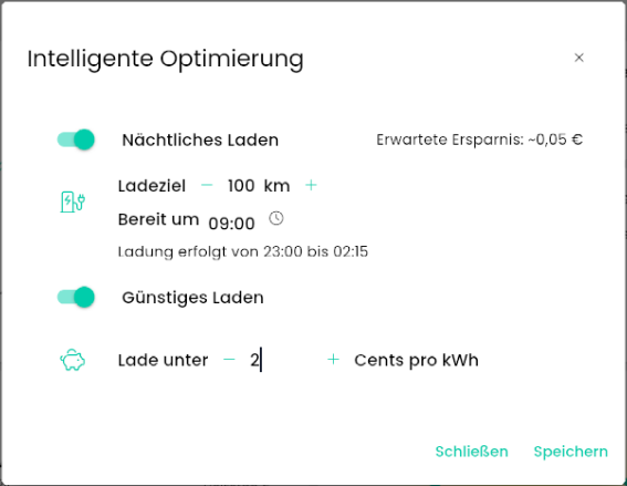
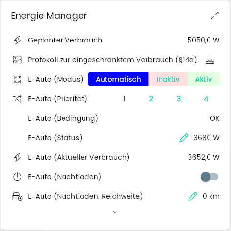
The Energy Manager intelligently switches devices when enough energy is available. This presentation makes it possible to change the priority of individual appliances using drag & drop or to exclude them from the calculation. In addition, the intelligent optimization like Overnight Charge or Cheap Charge can be configured within a dialog.
#### Requirements
The Energy Manager requires an [Instance](../concepts.md) of the module [Energy Manager](../modules/energy-manager.md).
### Appearance in Tile Visualization
#### As own Tile
#### Dialog for Intelligent Optimization
#### Within a List
### Appearance in the WebFront
This display is not supported by the WebFront. Instead, the instance is displayed as [List](object-presentation.md).
## Energy Distribution
Source: https://www.symcon.de/en/service/documentation/components/object-presentation/energy-distribution/
_Requires Symcon >= 7.0_
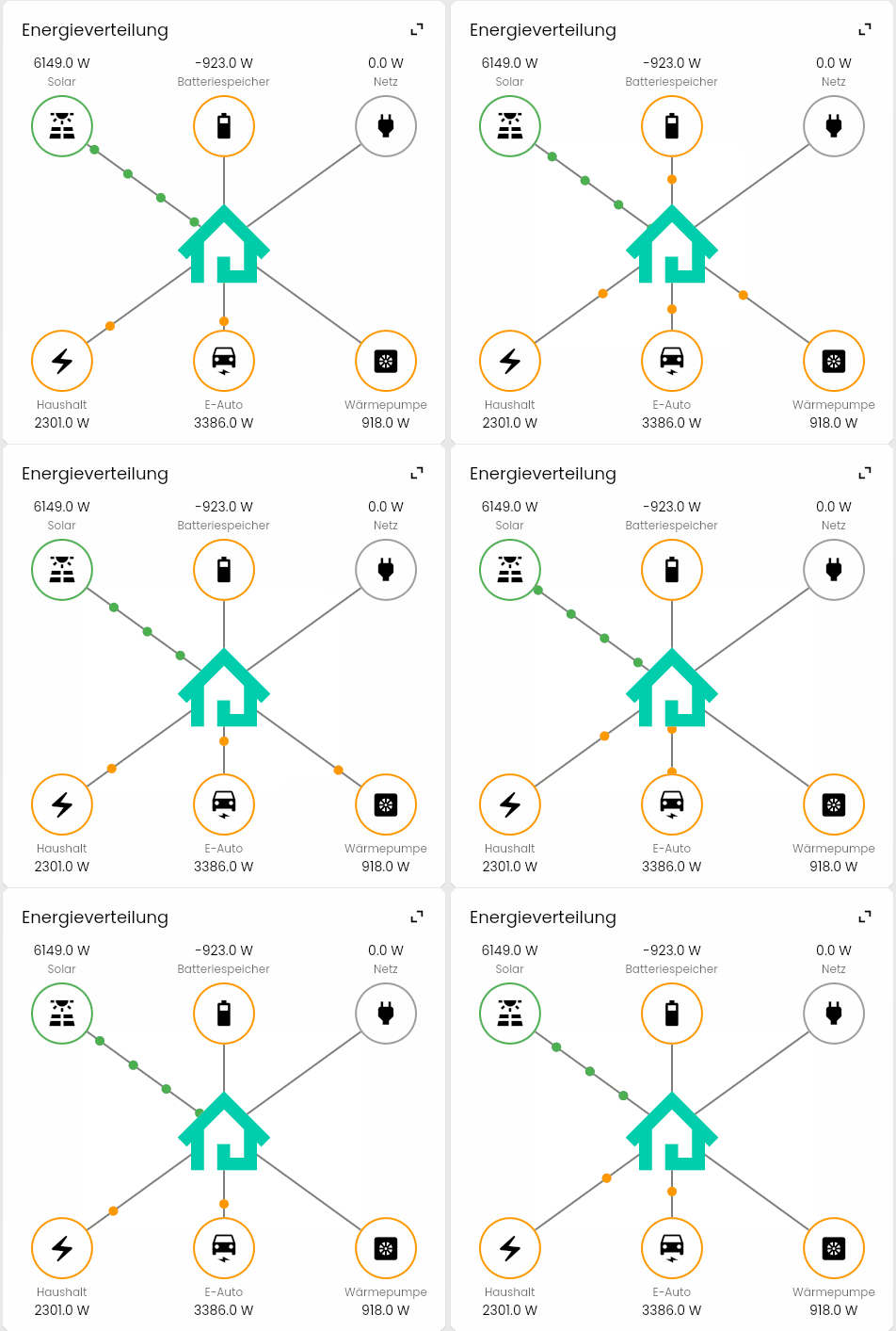
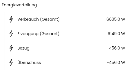
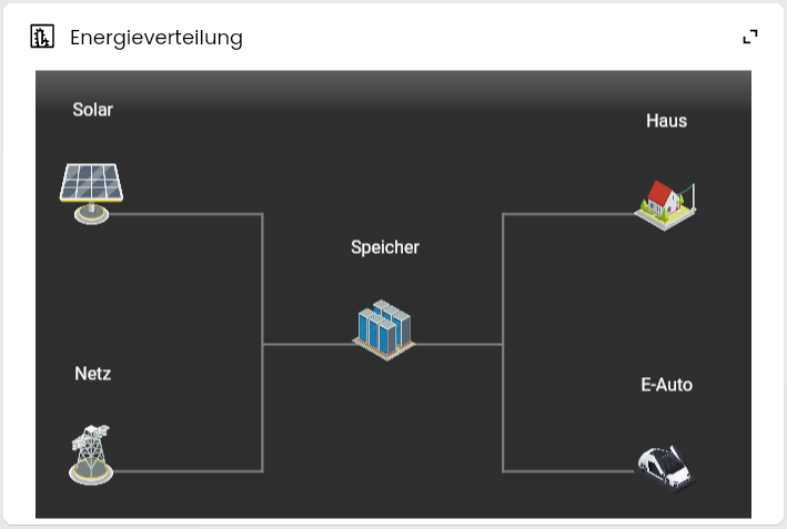
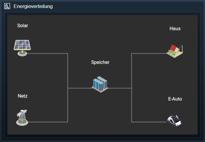
The Energy Distribution shows the flow of generated and consumed energy.
#### Requirements
The Energy Distribution display requires a [Instance](../concepts.md) of the module [Energy Distribution](object-presentation.md).
### Appearance in Tile Visualization
#### As own Tile
#### Within a List
### Appearance in the WebFront
This display is not supported by the WebFront. Instead, the instance is displayed as [List](object-presentation.md).
## Color
Source: https://www.symcon.de/en/service/documentation/components/object-presentation/color/
A color can be displayed and possibly configured with a Color.
### Requirements
An Color is a [Variable](../concepts.md) with the [presentation](../concepts.md) Color. To use this presentation, the variable must fulfill the following conditions:
* Type Integer or String
#### Parameter
| Parameter | Description |
| ------------------ | --------------------------------------------------------------------------------------------------------------------------------------------------------------------------------------------- |
| Encoding | Used encoding for the color, only adjustable for variables of type String |
| Default Values | List with default values that are offered in a selection, only available for variables with [Variable Action](../concepts.md). Not available if 'xy' encoding is selected |
| Color Sapce | The color space from which a color can be selected. This defines a triangle |
| Custom Color Space | List in which the red, green, blue value and white point of a custom color space can be defined. |
| Color Curve | If a color curve is selected, the selection of the color is limited to this |
| Custom Color Curve | A list of coordinates that define the |
### Display as legacy profile
If a variable uses the presentation [Legacy profile](object-presentation.md), it is displayed as a color if it also fulfills the following conditions:
* selected [Variable profile](../concepts.md) "~HexColor"
### Appearance in Tile Visualization
#### As own Tile with Variable Action
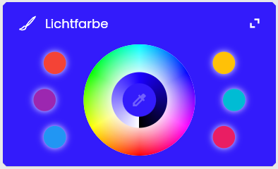
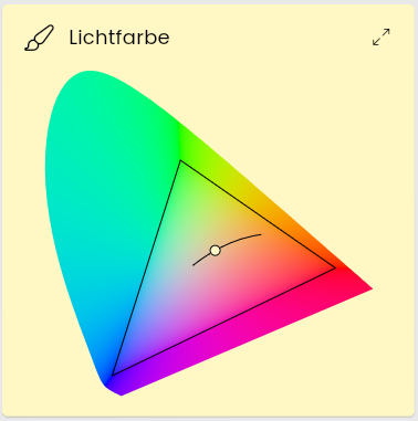
> **Note:** When selecting the pipette in the middle of the circle, a dialog opens to set the color alternatively in detail
#### As own Tile without Variable Action
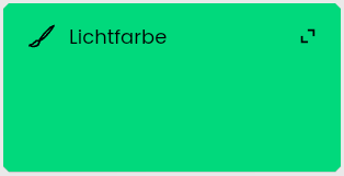
#### Within a List with Variable Action

When the pen is selected, a dialog opens, analogous to the display as a separate tile.
#### Within a List without Variable Action

### Appearance in the WebFront
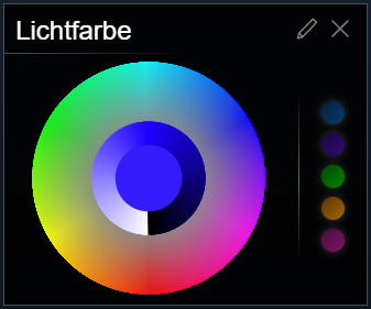
#### With Variable Action

Selecting the brush on the right opens a color selection dialog:
#### Without Variable Action

## Content Changer
Source: https://www.symcon.de/en/service/documentation/components/object-presentation/content-changer/
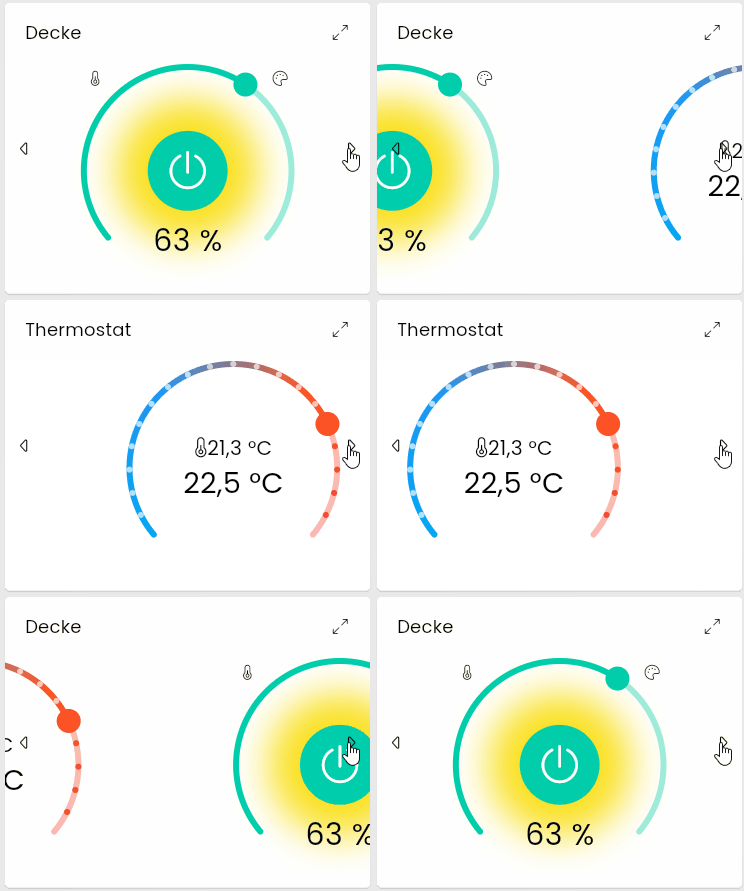
A content changer allows subordinate objects to be displayed within a single tile. The individual objects can be changed by clicking or automatically after a certain time.
#### Requirements
An object of the type [Category](../concepts.md) for which the content changer presentation was selected in the visualization in [edit mode](tile-visualization.md).
### Appearance in tile visualization
### Configuration
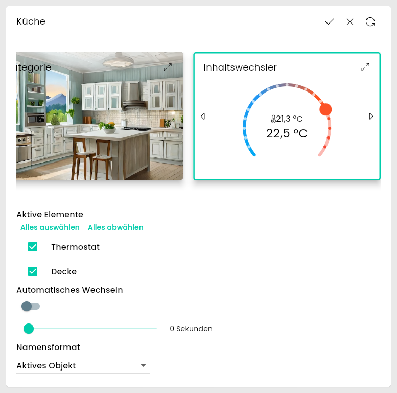
When a content changer is edited in the visualization, the following parameters are available.
| name | description |
| ---------------- | ------------------------------------------------------------------------------------------------------------------------- |
| Active Elements | Here you can select from all visible elements of the category which should be displayed. |
| Automatic Change | If active, the content changer jumps to the next element after a specified duration. The maximum duration is 100 seconds. |
| Name Format | The name to be displayed as the title of the tile. (Active object, category, active object and category) |
### Appearance in the WebFront
This presentation is displayed like a normal category.

Something similar can be achieved via the [Content changer](webfront-visualization.md) in the WebFront Editor.
## IPSView
Source: https://www.symcon.de/en/service/documentation/components/object-presentation/ipsview/
IPSViews can be seamlessly integrated into the visualization.
> **Note:** The extension [IPSView](https://ipsview.brownson.at/) must be purchased separately for use
#### Requirements
An IPSView is a [Medium](../concepts.md) of type IPSView.
### Appearance inTile Visualization
#### Als own Tile
#### Within a List

### Appearance in the WebFront
## Shutter
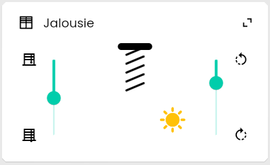
Source: https://www.symcon.de/en/service/documentation/components/object-presentation/shutter/
For a Shutter, the degree of opening and optionally the degree of inclination of the slats can be set.
### Requirements
A Shutter can be set either as [Variable](../concepts.md) or as [Instance](../concepts.md).
#### As a Variable
A variable with the [presentation](../concepts.md) shutter must fulfill the following requirements:
* Integer type
* Configured [Variable action](../concepts.md)
#### Parameter
| Parameter | Description |
| ------------------------ | ------------------------------------------------------------------------------------------------------------------------------------------------------------------------------------ |
| Usage type | Determines whether the slider is used to control the rotation of slats or the opening degree of a shutter. The Usage Type parameter determines which other parameters are available. |
| Open at | The value at which the shutter is considered open (only for the Open Usage Type) |
| Closed at | The value at which the shutter is considered closed (only for Open Usage Type) |
| Inside at | The value at which the slats are considered to be turned inwards (only for Rotation Usage Type) |
| Outside at | The value at which the slats are considered to be rotated outwards (only for Rotation Usage Type) |
| Rotation | The fixed rotation of the displayed slats (only for Open Usage Type) |
| Maximum Rotation Inside | The maximum inward rotation value of the slats in degrees (only for Rotation Usage Type) |
| Maximum Rotation Outside | The maximum outward rotation value of the slats in degrees (only for Rotation Usage Type) |
| Sun Position | Determines whether and where a sun should be displayed next to the shutter. The height of the sun depends on the time of day. A moon is displayed at night. |
#### As Instance
An instance can be displayed as a blind if the following child objects are present:
* Position (optional): Variable as described above with the ~Shutter profile
* Degree of rotation (optional): Variable as described above with the ~Lamella profile
At least one optional variable must exist.
> **Note:** The default size of Shutters can be configured separately in the grid settings for variables as "Shutter Variable" and instances as "Shutter"
#### Display as legacy profile
If a variable uses the presentation [Legacy profile](object-presentation.md), it is displayed as a shutter if one of the following [Variable profiles](../concepts.md) is selected:
* ~Shutter
* ~Lamella
The different profiles correspond to fixed parameter combinations.
#### ~Shutter
* Usage Type: Open
* Open At: 0
* Closed At: 100
* Rotation: -55°
* Sun Position: Right
#### ~Lamella
* Usage Tyoe: Rotation
* Inside At: 0
* Outside At: 100
* Maximum Rotation Inside: -55°
* Maximum Rotation Outside: 55°
* Sun Position: Right
### Appearance in Tile Visualization
#### As own Tile
#### Within a List
In the list view, the visualization falls back to the presentation [List](object-presentation.md).

### Appearance in the WebFront
This presentation is not supported by the WebFront. Instead, variables are displayed as [Slider](object-presentation.md) and instances are displayed as [List](object-presentation.md).
## Category
Source: https://www.symcon.de/en/service/documentation/components/object-presentation/category/
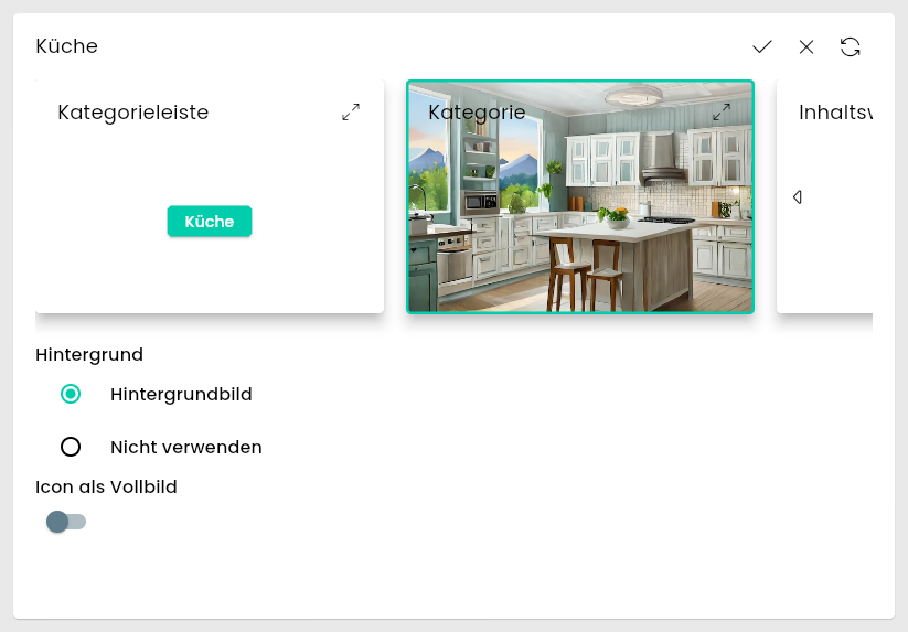
A category can be opened to view the objects it contains.
#### Requirements
An object of the type [Category](../concepts.md).
### Appearance in tile visualization
In the [Instance configuration](tile-visualization.md) 'Tiles' can be selected for 'Default category display'. This default setting can be overwritten in [edit mode](tile-visualization.md) in the visualization for each object.

### Configuration
When a category is edited in the visualization, the following parameters are available.
| Name | Description |
| ------------------- | --------------------------------------------------------------------------------------------------------------------------------------------------------------------------------------------------------------------------- |
| Background | If the category contains an image as [Media object](../concepts.md), this can be selected here as the background. The media object can also be made invisible via the 'Visual settings' in the console. |
| Icon as full screen | If active, the [Icon](icons.md) of the category object is displayed in the center of the tile |
### Appearance in the WebFront

## Category Bar
Source: https://www.symcon.de/en/service/documentation/components/object-presentation/category-bar/
A category can be opened to view the objects it contains.
#### Requirements
An object of the type [Category](../concepts.md).
### Appearance in tile visualization
In the [Instance configuration](tile-visualization.md) 'Category Bar (Single Line)' or 'Category Bar (Multiline)' can be selected for 'Default Category Display'. This default setting can be overwritten for each object in [edit mode](tile-visualization.md) in the visualization. In addition to the object name, the [Icon](icons.md) of the category is also displayed.

### Appearance in the WebFront

## Legacy Profile
Source: https://www.symcon.de/en/service/documentation/components/object-presentation/legacy-profile/
This [Variable presentation](../concepts.md) evaluates a [variable profile](../concepts.md) and translates it to the actual presentation.
##### Prerequisites
One [variable](../concepts.md) uses the "Legacy Profile" variable presentation. The presentation has no further prerequisites.
##### Parameter
| Parameter | Description |
| --------- | --------------------------------------------------------------------- |
| Profile | The underlying [variable profile](../concepts.md) |
The following variable presentations can be realized via Legacy Profile. The exact requirements can be found on the individual pages for the corresponding presentation:
- [Enumeration](object-presentation.md)
- [Date/Time](object-presentation.md)
- [Color](object-presentation.md)
- [HTML Box](object-presentation.md)
- [Shutter](object-presentation.md)
- [Switch](object-presentation.md)
- [Slider](object-presentation.md)
- [Value display](object-presentation.md)
- [Value input](object-presentation.md)
### Convert
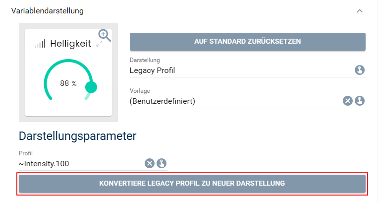
In the "Edit variable" dialog, a legacy presentation can be converted to its actual presentation via the corresponding button under the Variable presentation item.
## Light
Source: https://www.symcon.de/en/service/documentation/components/object-presentation/light/
_Requires Symcon >= 7.0_
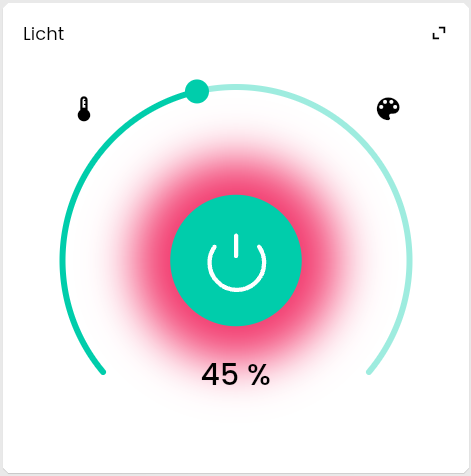
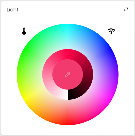
In the presentation Light, status, brightness, tuneable white and color can be visualized in a single tile.
#### Requirements
An [Instance](../concepts.md) can be displayed as light if the following child objects are present:
* Status:
* Uses the [variable presentation](../concepts.md) [Switch](object-presentation.md)
* Variable Usage of the variable is "On/Off"
* Brightness (optional):
* Uses the [variable presentation](../concepts.md) [Slider](object-presentation.md)
* Variable Usage of the variable is "Intensity"
* Tuneable White (optional):
* Uses the [variable presentation](../concepts.md) [Slider](object-presentation.md)
* Variable Usage of the variable is "Color Temperature"
* Color (optional):
* Uses the [variable presentation](../concepts.md) [Color](object-presentation.md)
* configured [Variable action](../concepts.md)
At least one optional variable must exist.
### Appearance in Tile Visualization
#### As own Tile
#### Within a List
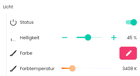
In the list view, the visualization falls back to the presentation [List](object-presentation.md).
### Appearance in the WebFront
This presentation is not supported by the WebFront. Instead, the instance is displayed as [List](object-presentation.md).
## List
Source: https://www.symcon.de/en/service/documentation/components/object-presentation/list/
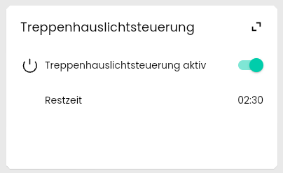
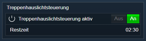
A list view can display any objects one below the other.
#### Requirements
Each [Instance](../concepts.md) can be displayed as a List.
> **Note:** If values are simply to be summarized without there being a suitable parent instance, a [Dummy module](../modules/dummy-module.md) can be used for structuring
### Appearance in Tile Visualization
#### As own Tile
#### Within a List

### Appearance in the WebFront
## Media Player
Source: https://www.symcon.de/en/service/documentation/components/object-presentation/media-player/
_Requires Symcon >= 7.0_
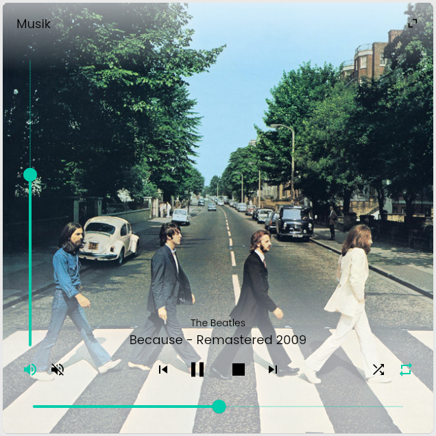
A Media Player can display various parameters for media playback and switch them if necessary:
- Play and pause media playback
- Stop media playback (optional)
- Jump to the next or previous element (optional)
- Display and adjust the progress of the current element (optional)
- Set volume (optional)
- Mute (optional)
- Set repeat (optional)
- Activate shuffle playback (optional)
- Display cover (optional)
- Show artist (optional)
- Show title (optional)
- Display and adjust current playlist including current position (optional)
### Requirements
A Media Player can be created either as [Variable](../concepts.md) or as [Instance](../concepts.md).
#### As a Variable
A variable that is to be displayed as a Media Player must fulfill the following requirements:
* Type Integer
* Set up [Variable action](../concepts.md)
* selected [Variable profile](../concepts.md):
* ~PlaybackNoStop: Only supports play and pause
* ~Playback: Supports playing, pausing and stopping
* ~PlaybackPreviousNextNoStop: Supports playing, pausing and jumping to the next or previous element
* ~PlaybackPreviousNext: Supports playing, pausing, stopping and jumping to the next or previous element
All other functions of the media player are not supported when displayed as variable.
#### As Instance
An instance can be displayed as a Media Player if the following child objects are present:
* Playback:
* Variable as described above
* Progress (optional):
* Variable of type integer
* Uses the [variable presentation](../concepts.md) [Slider](object-presentation.md)
* usage type of the variable is "Progress"
* If the variable has a variable action, the position can be adjusted, otherwise it is only displayed
* Volume (optional):
* Uses the [variable presentation](../concepts.md) [Slider](object-presentation.md)
* Variable Usage of the variable is "Volume"
* Mute (optional):
* Uses the [variable presentation](../concepts.md) [Switch](object-presentation.md)
* Variable Usage of the variable is "Mute"
* Repeat (optional):
* [Enumeration](object-presentation.md)
* Variable type Integer
* Variable profile "~Repeat"
* Shuffle (optional):
* [Enumeration](object-presentation.md)
* Variable type Boolean
* Variable profile "~Shuffle"
* Cover (optional):
* [Image](object-presentation.md)
* Artist (optional):
* Variable of type String
* Variable profile "~Artist"
* Title (optional):
* Variable of type String
* Variable profile "~Song"
* Playlist (optional):
* Variable of type String
* Variable profile "~Playlist"
* If the variable has a variable action, the position is customizable, otherwise it is only displayed
* The value for the playlist is a JSON-encoded object with the following parameters:
| parameter | type | description |
| ------------------ | ------- | --------------------------------------- |
| entries | Array | Entries of the playlist |
| current (optional) | Integer | The index of the currently active entry |
Structure of the entries
| Parameters | Type | Description |
| ----------------------------- | ------- | ----------------------------------------------------------------------------------------- |
| song (optional) | String | Title of the entry |
| artist (optional) | String | Artist of the entry |
| duration (optional) | Integer | Duration of the entry in seconds |
| Additional entries (optional) | any | Any other parameters can be added for the functionality. However, these are not displayed |
### Appearance in Tile Visualization
#### As own Tile
#### Within a List
In the list view, the visualization falls back to the presentation [List](object-presentation.md).

### Appearance in the WebFront
This display is not supported by the WebFront. Instead, variables are displayed as [Enumeration](object-presentation.md) and instances are displayed as [List](object-presentation.md).
## Messages
Source: https://www.symcon.de/en/service/documentation/components/object-presentation/messages/
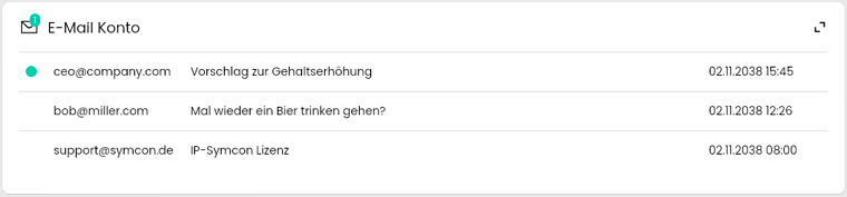
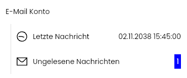
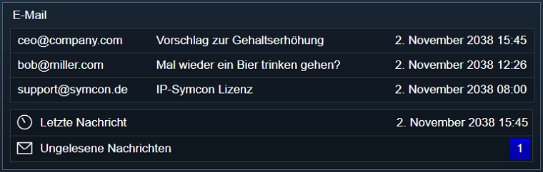
Messages visualizes the current messages and the number of unread.
#### Requirements
The presentation Messages requires an [Instance](../concepts.md) of the module [IMAP](../modules/imap.md) or [POP3](../modules/pop3.md).
### Appearance in Tile Visualization
#### As own Tile
#### Within a List
In the list view, the visualization falls back to the presentation [List](object-presentation.md).
### Appearance in the WebFront
## Popup
Source: https://www.symcon.de/en/service/documentation/components/object-presentation/popup/
Several objects can be displayed together in a Popup.
#### Prerequisites
A Popup is set up as [Popup Module Instance](../modules/popup-module.md). Displayed objects are placed or linked below the popup module.
### Appearance in Tile Visualization
A popup display in the visualization tile will follow in future versions, but is currently not available.
### Appearance in the WebFront


## Switch
Source: https://www.symcon.de/en/service/documentation/components/object-presentation/switch/
_Requires Symcon >= 5.0_
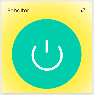
A Switch can be switched on (true) or off (false).
#### Requirements
A Switch is a [variable](../concepts.md) with the [presentation](../concepts.md) Switch. To use this presentation, the variable must fulfill the following conditions:
* Type Boolean
* Set up [Variable action](../concepts.md)
#### Parameter
| Parameter | Description |
| ------------------------------- | -------------------------------------------------------------------------------------------------------------------------------------------------------------------- |
| Individual icons based on value | If set, individual icons can be selected for true and false. Otherwise, a single icon is selected, which is always displayed |
| Icon | Icon which is permanently displayed on the switch (only available if "Individual icons based on value" is not set) |
| Icon for true | Icon which is displayed on the switch if the variable has the value true (only available if "Individual icons based on value" is set) |
| Icon for false | Icon which is displayed on the switch if the variable has the value false (only available if "Individual icons based on value" is set) |
| Color of glow while active | Configures the colour of the glow around the switch when it is active, i.e., when the variable has the value true |
| Intensity of glow while active | Configures the intensity of the glow around the switch when it is active, i.e., when the variable has the value true |
| Variable Usage | Use of the variable in summarized presentations. The value does not have a direct effect on the display of the variable, but only on its use in summarized displays. |
### Display as Legacy Profile
If a variable uses the presentation [Legacy profile](object-presentation.md), it is displayed as a Switch if it also fulfills the following conditions:
* no [Variable profile](../concepts.md) set or variable profile "~Switch" or "~Mute"
When using a variable profile, some parameters of the slider are derived
#### Variable Usage
The use depends on the profile name.
* On/Off for profile name
* ~Switch
* No profile
* Mute Switch for profile name "~Mute"
### Appearance in Tile Visualization
#### As own Tile
#### Within a List

### Appearance in the WebFront
Falls die Darstellung über ein Legacy-Profil erfolgt, unterscheidet das WebFront ob kein Variablenprofil gesetzt ist oder das Profil "~Switch" und hat für jeden Fall eine eigene Darstellung.
If the appearance occurs via Legacy profile, the WebFront distinguishes whether no variable profile is set or the "~Switch" profile and has a separate display for each case
#### With Presentation "Switch" or Profile ~Switch

#### Without Profile

## Slider
Source: https://www.symcon.de/en/service/documentation/components/object-presentation/slider/
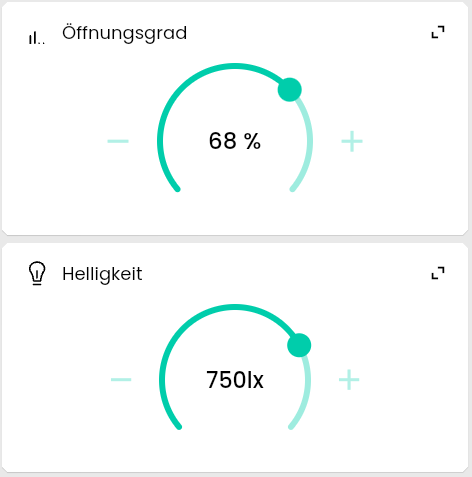
A slider can be used to set a specific value.
#### Prerequisites
An Slider is a [Variable](../concepts.md) with the [presentation](../concepts.md) Slider. To use this presentation, the variable must fulfill the following conditions:
* Type Integer or Float
* configured [Variable action](../concepts.md)
#### Parameter
| Parameter | Description |
| --------------------------------------------- | ------------------------------------------------------------------------------------------------------------------------------------------------------------------------------------------------------------------------------------------------------------------------ |
| Minimum Value | Minimum value of the slider |
| Maximum Value | Maximum value of the slider |
| Step Size | Size of a single step in the slider. At 0, the slider has no fixed step size. |
| Gradient | Defines the appearance of the gradient |
| Custom Gradient | Colors can be selected for specific values in the list. The gradient of the slider then consists of a gradient over the defined colors. (only visible and usable if gradient = "Custom") |
| Variable Usage | Use of the variable in summarized presentations. The value does not have a direct effect on the display of the variable, but only on its use in summarized displays. |
| Prefix | Is written in front of the variable value during formatting |
| Suffix | Is written after the variable value during formatting |
| Display Type | With "Percentage", the values are displayed as a percentage. This means that the minimum value is displayed as 0 and the maximum value as 100, regardless of their absolute values. Other values are also scaled accordingly. No conversion takes place with "Absolute". |
| Thousands Separator | Defines the thousands separator used when formatting the value |
| Digits | The number of decimal places that are displayed when formatting the value (only available for variables of type Float) |
| Decimal Separator | Defines the decimal separator used when formatting the value (only available for variables of type Float) |
| Icon | The [Icon](icons.md) that is used for the variable |
| Use updated parameters for specific intervals | Activates a list of intervals that can override the formatting in specific value ranges (not usable if Display Type = "Percentage") |
| Intervals | A list of intervals for overwriting the formatting in specific value ranges |
##### Intervals
| Parameters | Description |
| ----------------- | ------------------------------------------------------------------------------------------------------------------------------------------------------------------------------------------------------------------------------------ |
| Interval Start | The interval is applied from this value |
| Interval End | The interval is applied up to this value. If there is an interval with a start at this value, the other interval is used for the exact value for End and the defined interval is only used for values that are smaller than the end. |
| Display | If "Formatted Value" is selected, the value is formatted with adjusted parameters; if "Constant" is selected, the display is replaced by a constant value. |
| Constant | Defines the text that is to be displayed without further formatting for values within this interval. (only available if Display = "Constant") |
| Conversion Factor | Before formatting, the value is divided by the conversion factor (only available if display = "Formatted Value") |
| Overwrite Prefix | If the switch is activated, the prefix defined in the interval is used instead of the prefix of the main configuration (only available if display = "Formatted Value") |
| Prefix | Prefix used within the interval (only available if the "Overwrite Prefix" switch is active) |
| Overwrite Suffix | If the switch is activated, the suffix defined in the interval is used instead of the suffix of the main configuration (only available if display = "Formatted Value") |
| Suffix | Suffix used within the interval (only available if the "Overwrite Suffix" switch is active) |
| Overwrite Digits | If the switch is activated, the digits defined in the interval is used instead of the digits of the main configuration (only available if display = "Formatted Value") |
| Digits | Decimal places used within the interval (only available if the "Overwrite Digits" switch is active) |
| Overwrite Icon | If the switch is activated, the icon defined in the interval is used instead of the icon of the main configuration |
| Icon | Icon used within the interval (only available if the "Overwrite icon" switch is active) |
### Display as Legacy Profile
If a variable uses the presentation [Legacy profile](object-presentation.md), it is displayed as a slider if it also fulfills the following conditions:
* Does not fulfill the conditions of any of the following presentations:
* [Shutter](object-presentation.md)
* [Enumeration](object-presentation.md)
* [Variable profile](../concepts.md) with the following parameters:
* Max value > Min value
* Any increment, but has an influence on the increment of the slider
When using a variable profile, some parameters of the slider are derived
#### Gradient
The gradient depends on the profile name.
* Temperature for profile name
* ~Temperature
* ~Temperature.Difference
* ~Temperature.Fahrenheit
* ~Temperature.Room
* Color temperature for profile name "~TWColor"
* Default otherwise
#### Variable Usage
The use depends on the profile name.
* Temperature for profile name
* ~Temperature
* ~Temperature.Difference
* ~Temperature.Fahrenheit
* ~Temperature.Room
* Color temperature for profile name "~TWColor"
* Intensity if profile name begins with "~Intensity." begins
* Volume for profile name "~Volume"
* Progress for profile name "~Progress"
* None of these otherwise
#### Display type
"Percentage" if suffix "%", otherwise "Absolute"
### Appearance in visualization tile
#### As own tile
#### Within a list

### Appearance in the WebFront
The WebFront differentiates according to the display type and has a separate display for each case:
#### Display type "Absolute"

#### Display type "Percentage"

## Stream
Source: https://www.symcon.de/en/service/documentation/components/object-presentation/stream/
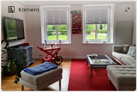
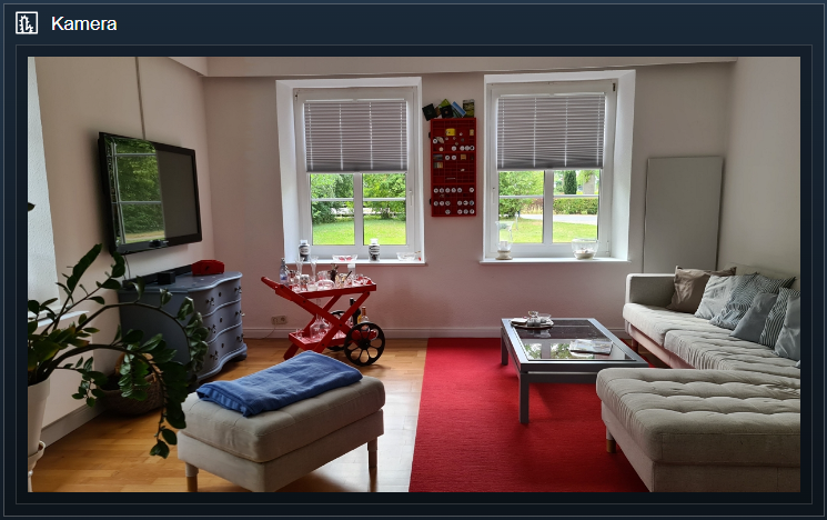
Streams represent the video output, for example from a surveillance camera.
#### Requirements
A Stream is a [Medium](../concepts.md) of type [Stream](../concepts.md).
### Appearance in Tile Visualization
#### As own Tile
#### Within a List

### Appearance in the WebFront
## Scenes
Source: https://www.symcon.de/en/service/documentation/components/object-presentation/scenes/
_Requires Symcon >= 7.0_
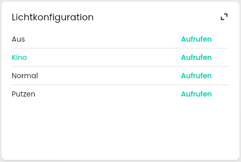
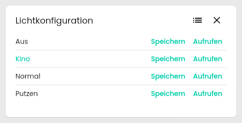
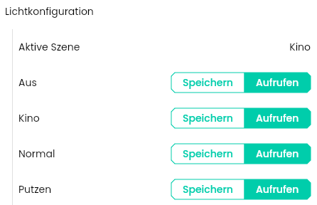
Various device settings can be saved together as a scene and called up again.
#### Requirements
Scenes require an [Instance](../concepts.md) of the module [Scene Control](../modules/scene-control.md).
### Appearance in Tile Visualization
#### As own Tile
#### In Full Screen
#### Within a List
In the list view, the visualization falls back to the presentation [List](object-presentation.md).
### Appearance in the WebFront
This presentation is not supported by the WebFront. Instead, the instance is displayed as [List](object-presentation.md).
## Thermostat
Source: https://www.symcon.de/en/service/documentation/components/object-presentation/thermostat/
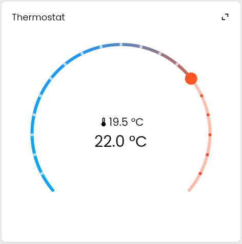
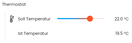
A Thermostat allows setting a desired temperature combined with a display of the current temperature.
#### Requirements
An [Instance](../concepts.md) can be displayed as a Thermostat if the following child objects are present:
* Set temperature:
* uses the [variable presentation](../concepts.md) [Slider](object-presentation.md)
* usage type of the variable is "Temperature"
* Current temperature:
* Uses the [variable presentation](../concepts.md) [Value Presentation](object-presentation.md)
* usage type of the variable is "Temperature"
### Appearance in Tile Visualization
#### As own Tile
#### Within a List
In the list view, the visualization falls back to the presentation [List](object-presentation.md).
### Appearance in the WebFront
This presentation is not supported by the WebFront. Instead, the instance is displayed as [List](object-presentation.md).
## Sound
Source: https://www.symcon.de/en/service/documentation/components/object-presentation/sound/
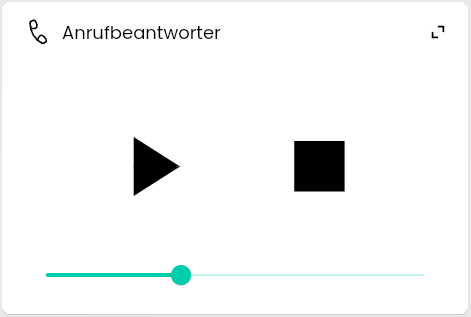
Audio files can be integrated and played back in the visualization.
#### Requirements
A Sound is a [Medium](../concepts.md) of the type [Sound](../concepts.md).
### Appearance in Tile Visualization
#### As own Tile
The progress bar and the stop button can be omitted depending on the size of the tile.
#### Within a List

### Appearance in the WebFront
The display may vary depending on the browser.

## Web Content
Source: https://www.symcon.de/en/service/documentation/components/object-presentation/web-content/
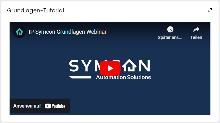
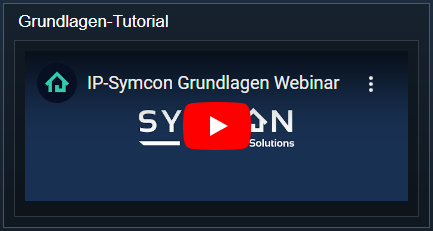
Web Content can display any HTML content and therefore offers experts the option of displaying individual elements. By default, CSS displays text within the presentation in the same way as the rest of the visualization. In addition, the address of any website can be entered to display it in the visualization.
#### Requirements
Web Content is a [Variable](../concepts.md) with the [presentation](../concepts.md) Web Content. To use this presentation, the variable must fulfill the following conditions:
* Type String
* No configured [Variable action](../concepts.md)
### Parameters
| Parameters | Description |
| -------------- | ----------------------------------------------------------------------------------------------------------------------------------------------------------------------------- |
| Display Type | For "HTML content", the variable value is interpreted and displayed as HTML. For "Website", the address of a website can be specified as long as it does not block embedding. |
| Remove Padding | If activated, the borders of the tile are removed. |
### Display as legacy profile
If a variable uses the presentation [Legacy profile](object-presentation.md), it is displayed as Web Content if it also fulfills the following conditions:
* Selected [variable profile](../concepts.md) ~HTMLBox
### Appearance in Tile Visualization
#### As own Tile
#### Within a List

### Appearance in the WebFront
## Value Presentation
Source: https://www.symcon.de/en/service/documentation/components/object-presentation/value-presentation/
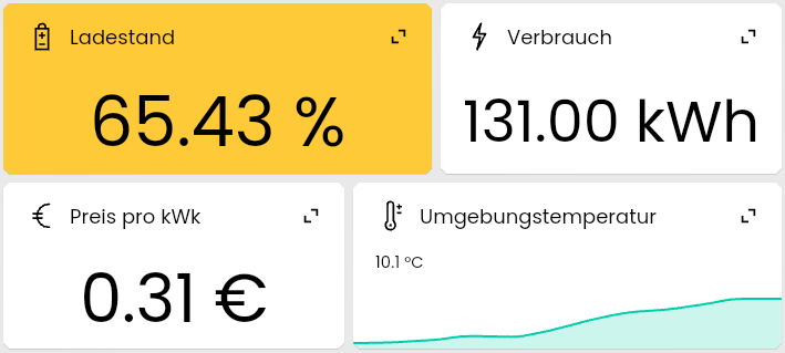
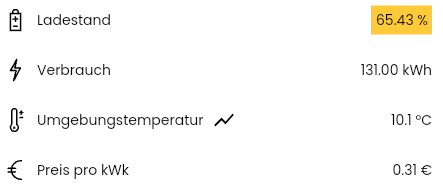
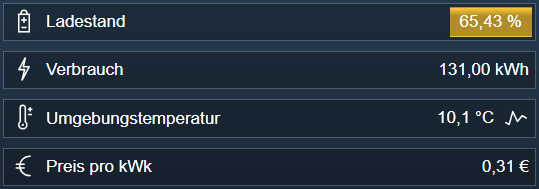
Displays a value, optionally with background color or value progression.
### Requirements
A value presentation is a [variable](../concepts.md) with the [presentation](../concepts.md) value presentation. To use this presentation, the variable must fulfill the following conditions:
* No set up [Variable action](../concepts.md)
### Parameters
Depending on the variable type (Boolean, Integer, Float, String), different parameters are available. The following apply to all of them.
| Parameter | Description |
| ------------- | --------------------------------------------------------------------------------------- |
| Default icon | The icon that is displayed. It can be overwritten by other parameters |
| Default color | The color with which the value is highlighted |
| Prefix | Is written in front of the variable value during formatting (Not available for Boolean) |
| Suffix | Is written after the variable value during formatting (Not available for Boolean) |
#### Float and Integer
| Parameter | Description |
| --------------------------------------------- | ------------------------------------------------------------------------------------------------------------------------------------------------------------------------------------------------------------------------------------------------------------------------ |
| Usage type | Use of the variable in summarized presentations. The value does not have a direct effect on the display of the variable, but only on its use in summarized displays. |
| Display type | With "Percentage", the values are displayed as a percentage. This means that the minimum value is displayed as 0 and the maximum value as 100, regardless of their absolute values. Other values are also scaled accordingly. No conversion takes place with "Absolute". |
| Thousands separator | Defines the thousands separator used when formatting the value |
| Minimum value | Minimum value of the variable (only usable if display type = "Percentage") |
| Maximum value | Maximum value of the variable (only usable if display type = "Percentage") |
| Decimal places | The number of decimal places that are displayed when formatting the value (only available for variables of type Float) |
| Decimal separator | Defines the decimal separator used when formatting the value (only available for variables of type Float) |
| Icon | The [Icon](icons.md) that is used for the variable |
| Use updated parameters for specific intervals | Activates a list of intervals that can override the formatting in specific value ranges (not usable if display type = "Percentage") |
| Intervals | A list of Intervals for overwriting the formatting in specific value ranges |
##### Intervals
| Parameters | Description |
| ------------------------ | ------------------------------------------------------------------------------------------------------------------------------------------------------------------------------------------------------------------------------------ |
| Start of interval | The interval is applied from this value |
| End of interval | The interval is applied up to this value. If there is an interval with a start at this value, the other interval is used for the exact value for End and the defined interval is only used for values that are smaller than the end. |
| Display | If "Formatted value" is selected, the value is formatted with adjusted parameters; if "Constant" is selected, the display is replaced by a constant value. |
| Constant | Defines the text that is to be displayed without further formatting for values within this interval. (only available if display = "Constant") |
| Conversion factor | Before formatting, the value is divided by the conversion factor (only available if display = "Formatted value") |
| Overwrite prefix | If the switch is activated, the prefix defined in the interval is used instead of the prefix of the main configuration (only available if display = "Formatted value") |
| Prefix | Prefix used within the interval (only available if the "Overwrite prefix" switch is active) |
| Overwrite suffix | If the switch is activated, the suffix defined in the interval is used instead of the suffix of the main configuration (only available if display = "Formatted value") |
| Suffix | Suffix used within the interval (only available if the "Overwrite suffix" switch is active) |
| Overwrite decimal places | If the switch is activated, not the decimal places of the main configuration are used, but the decimal places defined in the interval (only available if display = "Formatted value" and variable of type Float) |
| Digits | Decimal places used within the interval (only available if the "Overwrite decimal places" switch is active) |
| Overwrite icon | If the switch is activated, the icon defined in the interval is used instead of the icon of the main configuration |
| Icon | Icon used within the interval (only available if the "Overwrite icon" switch is active) |
| Overwrite color | If the switch is activated, the color defined in the interval is used instead of the color of the main configuration |
| Color | Color used within the interval (only available if the "Overwrite color" switch is active) |
#### Boolean and String
| Parameters | Description |
| ---------- | -------------------------------------------------------------------------------------------------------------------------------------------------------- |
| Multiline | (String only) Displays the variable value in multiple lines |
| Options | The individual Options of the display, which allow specific texts, colors and icons to be displayed for different variable values |
##### Options
| Parameter | Description |
| -------------- | -------------------------------------------------------------------------------------------------------------- |
| Value | The option is applied for this variable value |
| Label | Text displayed for this option |
| Overwrite icon | If set, the default icon for this presentation is overwritten if the variable has the value of this option |
| Icon | Icon for the variable if the variable has the value of this option (only available if "Overwrite icon" is set) |
| Color | Color that is used to display this option inside the enumeration |
#### Value progression
If the [Logging](../modules/archive-control.md) is activated for the variable, a preview of the value history is displayed.
### Display as legacy profile
If a variable uses the presentation [Legacy profile](object-presentation.md), it is displayed as a value presentation if it fulfills the following conditions:
* Does not fulfill the conditions of one of the following presentations:
* [Date/Time](object-presentation.md)
* [Color Presentation](object-presentation.md)
* [Multi-row Textbox](object-presentation.md)
* [HTML Box](object-presentation.md)
When using a variable profile, some parameters of the value display are derived
#### Use of the variables
The usage type depends on the profile name.
* Temperature for profile name
* ~Temperature
* ~Temperature.Difference
* ~Temperature.Fahrenheit
* ~Temperature.Room
#### Display type
“Percentage” if suffix ‘%’, otherwise ”Absolute”
### Appearance in tile visualization
#### As own tile
#### Within a list
### Appearance in the WebFront
No preview of the value history is displayed in the WebFront.
## Value Input
Source: https://www.symcon.de/en/service/documentation/components/object-presentation/value-input/
_Requires Symcon >= 5.0_
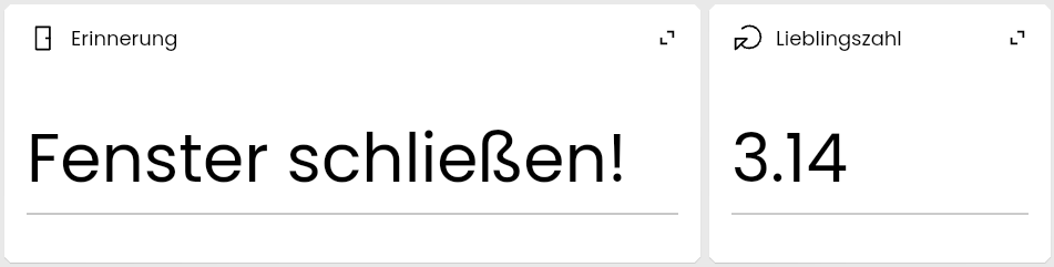
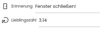
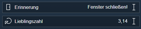
A Value Input allows you to change values as free text.
### Requirements
A Value Input is a [variable](../concepts.md) with the [presentation](../concepts.md) Value Input. To use this spresentation, the variable must fulfill the following conditions:
* configured [Variable action](../concepts.md)
* Variable type Integer, Float, or String
#### Parameters
| Parameter | Description |
| --------------- | --------------------------------------------------------------------------------------------------------------------------------------------------- |
| Prefix | Is written in front of the variable value during formatting |
| Suffix | Is written after the variable value during formatting |
| Multiline Input | If active, input over multiple lines is possible. Otherwise, the input is restricted to a single line (only available for variables of type String) |
> **Note:** If the variable is numeric, inputs that are not numbers are filtered out
### Display as legacy profile
If a variable uses the presentation [Legacy profile](object-presentation.md), it is displayed as a Value Input
* no [Variable profile](../concepts.md) or variable profile "~TextBox"
When using a variable profile, the parameter "Multiline Input" is active for the variable profile "~TextBox" and inactive otherwise.
### Appearance in Tile Visualization
#### As own Tile
#### Within a List
### Appearance in the WebFront
## Schedule Event
Source: https://www.symcon.de/en/service/documentation/components/object-presentation/event-schedule/
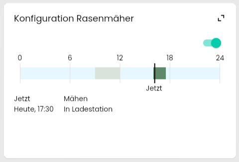
A Schedule Event can be viewed and configured in the visualization.
#### Requirements
A Schedule Event is an [Event](../concepts.md) of type [Schedule](../concepts.md).
### Appearance in Tile Visualization
#### Als own Tile
#### Within a List

### Appearance in the WebFront

## Cyclic Event
Source: https://www.symcon.de/en/service/documentation/components/object-presentation/event-cyclic/
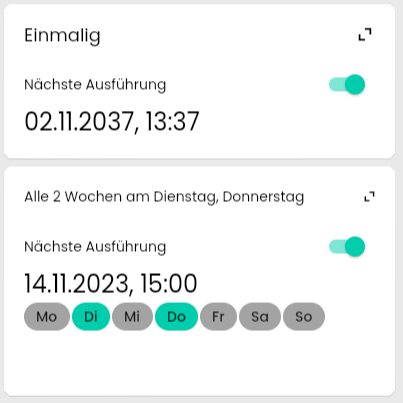
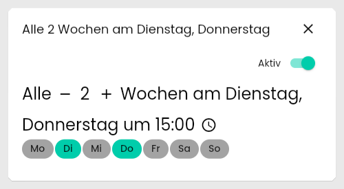
A Cyclic Event can be viewed and configured in the visualization.
#### Requirements
A cyclic event is an [Event](../concepts.md) of type [Cyclic](../concepts.md).
### Appearance in Tile Visualization
#### As own Tile
#### In Full Screen
#### Within a List

### Appearance in the WebFront
