# WebFront Visualization
> Symcon documentation · English · generated on 2026-09-26
> Index: https://www.symcon.de/en/llms.txt
Source: https://www.symcon.de/en/service/documentation/components/webfront-visualization/
> **Warning:** The WebFront is still supported. However, since version 7.0, the [Tile Visualization](tile-visualization.md) was introduced as modern visualization. Even though the WebFront is still usable and is maintained regarding errors and compatibility, there will be no new features. It is recommended to use the Tile Visualization.
> **Note:** The WebFront does not have to be configured and can be used completely without any advanced settings. All possibilities presented here are optional and can be used by experienced users, in order to better adapt visualizations to their needs.
The WebFront offers a simple and attractive way to display and switch devices, display images, and run scripts.
### WebFront Versions
| Version | Description |
| ------------------------- | -------------------------------------------------------------------------------------------------------------------------------------------------------------------------------------------------------------------------------------------------------------------------------------------------------------------------------------------- |
| WebFront (incl. Editor) | The HTML5 Version of the WebFront can be opened and operated with the current versions of common web browsers. These include:
* Google Chrome (25+) [officially recommended]
* Mozilla Firefox (34+)
* Apple Safari (OS X 10.9+)
* Opera (12+, CSS3 animations only with Opera Next)
* Microsoft Internet Explorer (10+) |
| WebFront (without Editor) | * Apple iOS (7.0+)
* Google Android (4.0+) |
| Mobile (iOS) | IP-Symcon Mobile is a native app that can be downloaded directly from the AppStore. All iOS devices with iOS 6.x or later are supported.
IP-Symcon Mobile for iPhone, iPod touch and iPad in the iTunes App Store |
| Mobile (Android) | The Android counterpart to IP-Symcon Mobile is also a native app that can be downloaded directly via Google Play.
IP-Symcon Mobile for Android devices at Google Play |
### Installation
The WebFront is immediately available and can be opened by clicking "Open Visualization". The WebFront is also be available to all other devices with browsers
in the network. If the computer on which the IP-Symcon Server is installed is called Home Server, the WebFront is available under the address http://Home Server:82/
in the local network. If the computer’s IP address, e.g., 192.168.1.2, is known, the WebFront can also be opened under the address http://192.168.1.2:82/.
### Configuration
The WebFront generally runs without any further necessary configuration. However, various settings can be changed. The relevant documentation can be taken from the subpages of this document. The general, version-comprehensive configuration is described in more detail below.
A choice of icons for objects in WebFront can be found under [Icons](icons.md).
### Open configuration
Configuration can be started directly from the welcome page of the IP-Symcon [Management Console](management-console.md). The configuration can be opened via the menu item ‘Configure WebFront’.
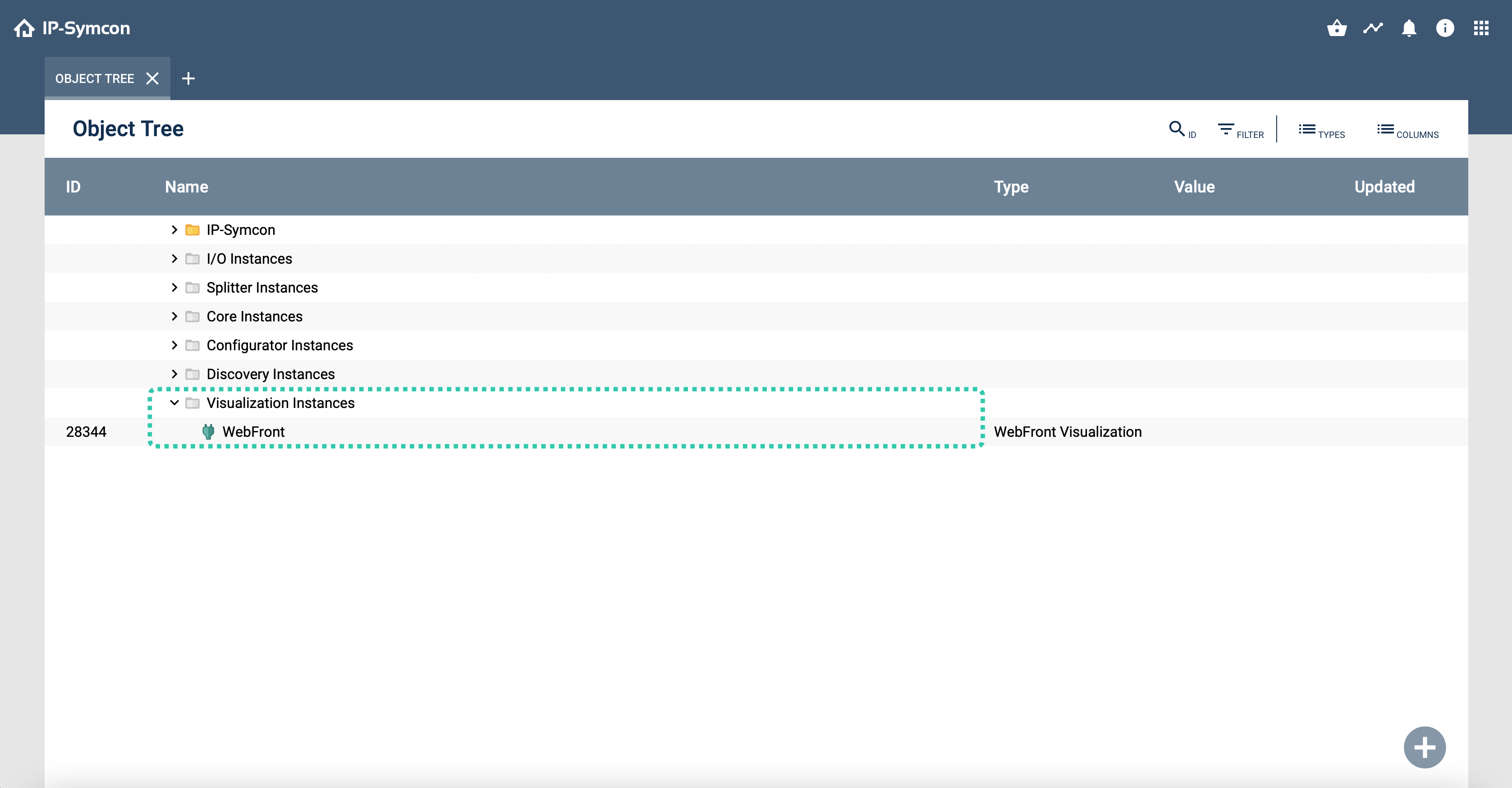
### Configurators
IP-Symcon Basic contains a configurator that only supports limited changes. Up to five different configurators can be created in the IP-Symcon Professional Edition that can be retrieved on their own using the WebFront start page and be secured with a password, if desired. A configurator can be created as an independent unit, e.g. for a visualizations object, represent a special view for a maintenance technician, or simply create a security-specific separation. The same options are available for each configurator, which can be adapted as desired. As many configurators as you like can be created in the Unlimited Edition.
## Web
Source: https://www.symcon.de/en/service/documentation/components/webfront-visualization/web/
_Requires Symcon >= 3.0_
> **Warning:** The __IP-Symcon Professional__ or __IP-Symcon Unlimited__ edition is required to configure WebFronts
> **Warning:** Only objects, which were previously created in the [Object Tree](management-console.md) of the [Management Console](management-console.md), can be added and displayed in the WebFront. The WebFront Editor cannot create new categories or objects. It is only used to arrange existing objects according to your individual preferences.
> **Note:** Scripts that are executed via the WebFront provide these [System Variables](../concepts/automations.md)
### Operation
At the top of the screen you can select elements that were set up in the WebFront. By default, these are IP-Symcon for building control and weather to display the current weather data and forecasts of the German Weather Service. Clicking a module name displays its content in the middle section. The current module name is highlighted. The middle section displays the main elements of a module. The other bars at the top of the screen offer control options for the currently selected category.
### WebFront-Editor
[Video](https://www.youtube.com/embed/523XW-o7d1k?rel=0&cc_load_policy=1)
### Configuring
The configuration is divided into several parts. Different settings can be adjusted in each tab. This article primarily presents the settings options for the regular WebFront.
The following settings can be adjusted in the individual tabs:
| Tab | Description |
| --------------------------------------------------------------- | ---------------------------------------------------------------------------------- |
| [Editor](webfront-visualization.md)
(since 5.0) | Starts the WebFront editor |
| [Appearance](webfront-visualization.md) | Configuration of a title and icon in the login screen |
| [Security](../getting-started.md) | A password for access control and a special IP AutoStart function can be set |
| [Notifications](https://www.symcon.de/en/product/notifications/) | Allows sending test messages to configured devices and removing registered devices |
| [Structure](webfront-visualization.md)
(up to 4.4) | Configuration of the individual elements of a WebFront |
### Setting Up Another WebFront
> **Warning:** To use more than one WebFront, you need an __IP-Symcon Professional__ or __IP-Symcon Unlimited__ edition.
In the “Visualization” section of the management console, you can display an overview of all WebFront configurators via “configure visualization”. To create a new configurator and thus a new WebFront, you have to click "New". The name of the configurator instance is also the name of the WebFront in the browser.
## Notifications
Source: https://www.symcon.de/en/service/documentation/components/webfront-visualization/web/notifications/
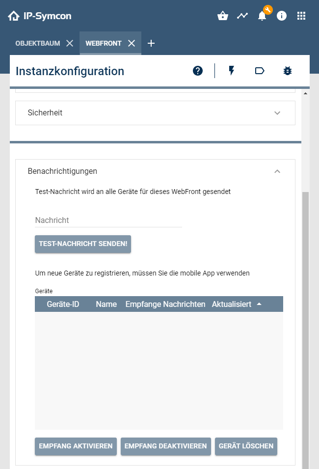
The tab provides an overview of the registered devices. It can be selected whether the respective devices receive messages.
Also, a test message can be sent.
### Registering to the push message service
The first time a mobile device successfully logs in to a WebFront, that device will automatically be added to the push message service for this Configurator. If no push messages are to be sent to this device, then this device must be explicitly deactivated for reception in the configurator. Note that if the password for the configurator is changed or the mobile access is completely disabled, the registration to the push message service remains untouched. If a device is completely removed from the list, it will be handled as an unknown device at the next login and added to the push message service again.
### Notification Control
The messages are sent via Notification Control.
Further information can be found under [Notification Control](../modules/notification-control.md).
## Appearance
Source: https://www.symcon.de/en/service/documentation/components/webfront-visualization/web/appearance/
### Appearance
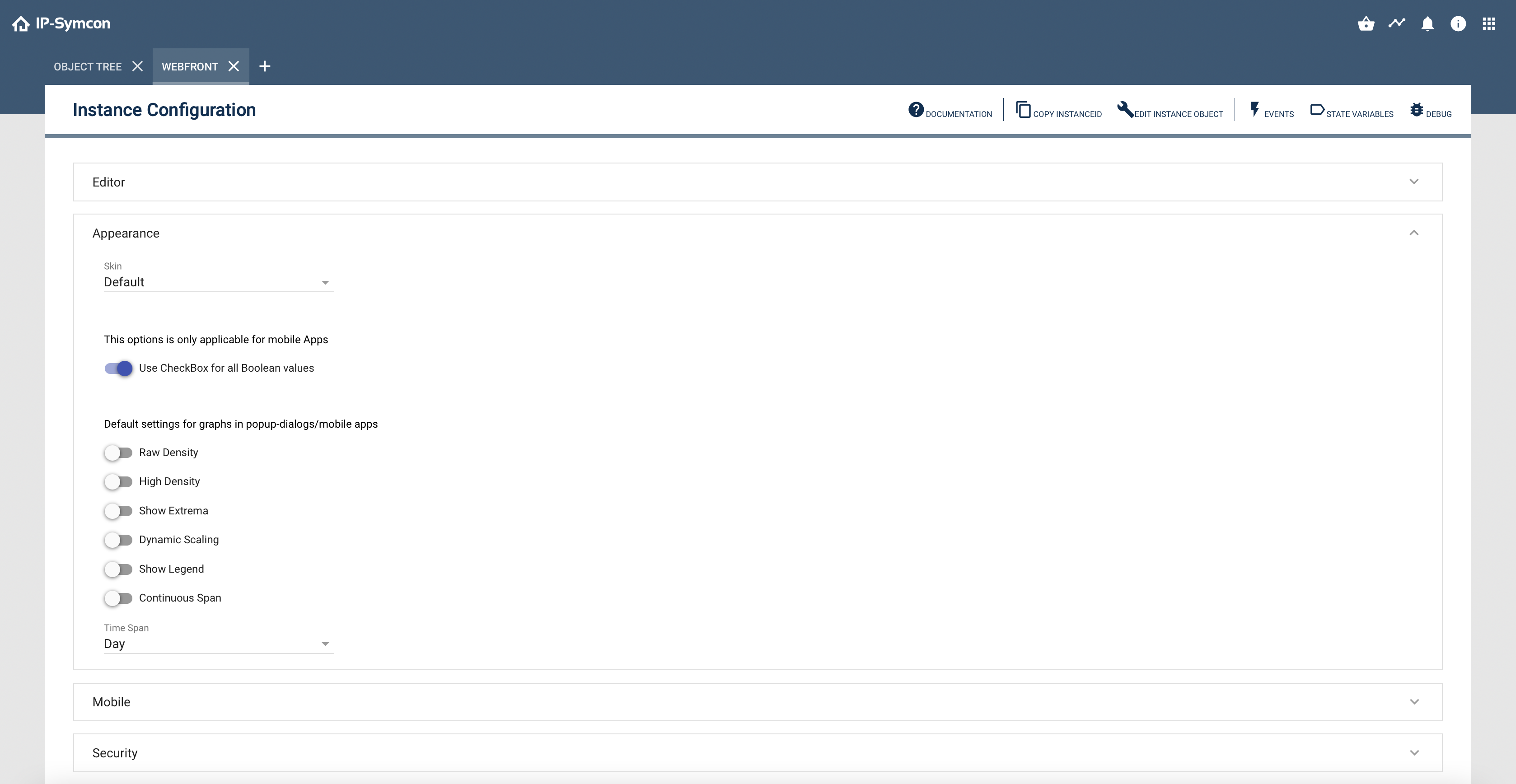
The appearance tab takes care of the visual presentation and possible default settings of the WebFront.
### Name, Icon, Visibility
Via "Configure" various default settings can be selected.
### Skin
Since IP Symcon 3.0 it is possible to design the WebFront via skins. Further information is available in the [Skin Control](../modules/skin-control.md).
### Nesting
Since IP-Symcon 5.5 this option is enabled by default und enables the presentation of nested elements, e.g., instances below instances. The mobile apps with version 5.5 or newer also support this option. After activation, this option cannot be disabled again as it should removed in the long term.
### Default Popup Graph Settings
Default settings for popup graphs can be defined here. The exact meaning of the options is explained in [Display types of charts](../concepts.md)
## Editor
Source: https://www.symcon.de/en/service/documentation/components/webfront-visualization/web/editor/
The editor can be opened from the WebFront configurator via the button "Open WebFront Editor" under "Editor".
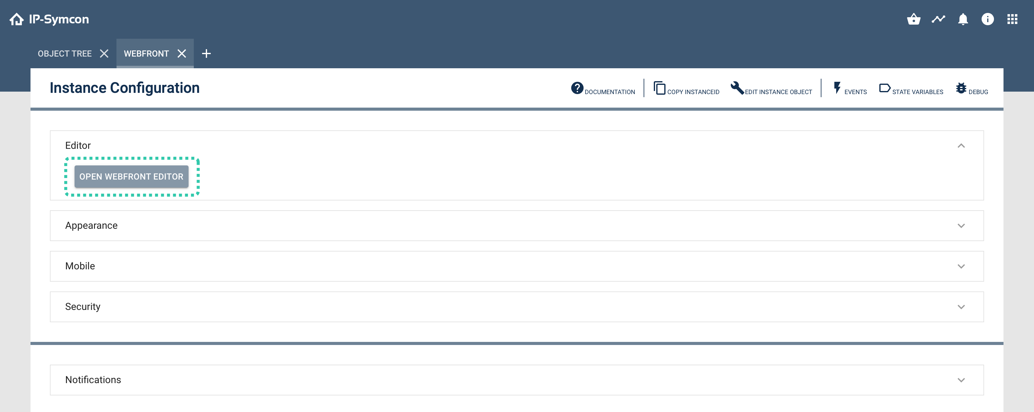
> **Warning:** A Professional license or higher is required to use all features of the WebFront editor. Otherwise, the extent is severely limited.
### Usage of the editor
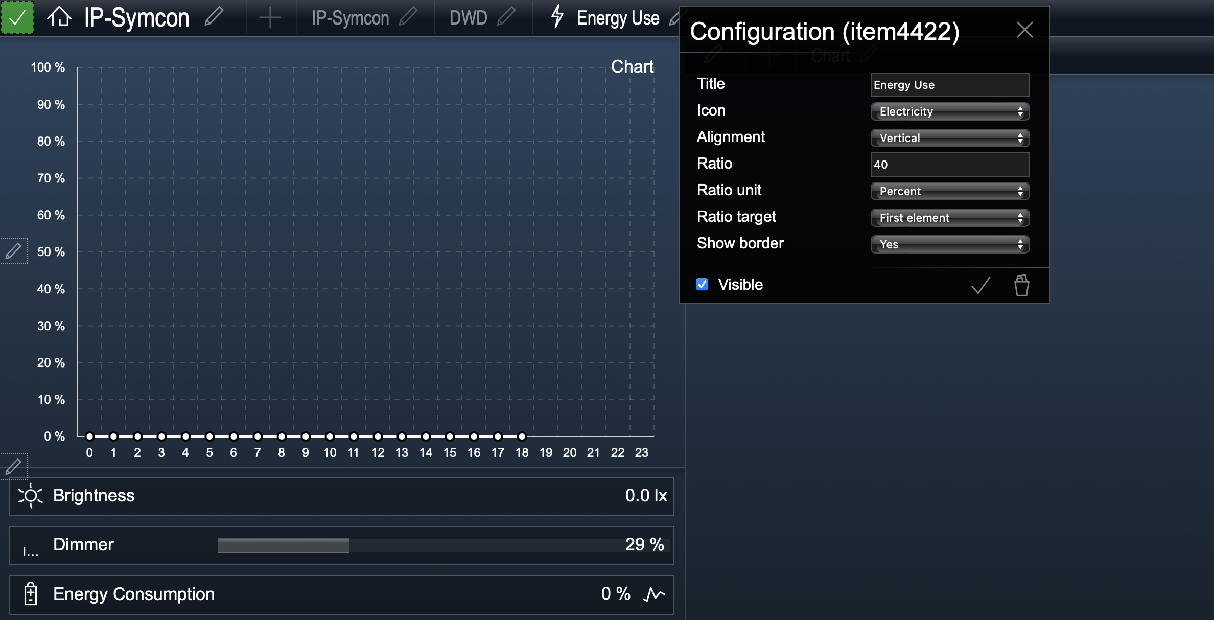
Within the editor, the [WebFront](webfront-visualization.md) is displayed as usual and is extended by configuration elements. With a click on the plus, an element can be added. Added elements can be configured via a click on the pen. A dialog is opened where the parameters of the element can be configured. The individual parameters of the different elements are explained in their individual documentation pages. After adjusting the parameters, these are confirmed by clicking the check mark. Alternatively, an element can deleted by clicking the trash can in the dialog. Finally, the changes need to be confirmed by clicking the green check mark at the top left. Otherwise, the changes are not saved.
### Overview of available elements
| Element | Description |
| ------------------------------------------------------ | -------------------------------------------------------------------------------------------------------------------------------------------------------------------------------------------------------------------------------------------------------------------------------------------------------------------------------------------------------------------------------------------- |
| [Category](webfront-visualization.md) | This element displays a category and all its sub-objects in the WebFront. The ID of the category to be displayed can be changed through the start category parameter. |
| [Graph](webfront-visualization.md) | With this element, the graphs set in the Archive Module are displayed directly. Normally, graphs can be called using the icon located at the left of the value of the variable. If graphs should be embedded directly, for example in [TabPanes](webfront-visualization.md) or [SplitPanes](webfront-visualization.md), this can be done using the graph element. |
| [External Page](webfront-visualization.md) | This element inserts an external site in the WebFront via an IFrame. The URL parameter and interval are available. |
| [Content Changer](webfront-visualization.md) | The Content Changer allows switching between multiple [Images](../concepts.md), [Streams](../concepts.md), [HTML Boxes](object-presentation.md), [Text Boxes](object-presentation.md) or mail instances ([IMAP](../modules/imap.md), [POP3](../modules/pop3.md)) within a single page. |
| [SplitPane](webfront-visualization.md) | Using the SplitPanes, the WebFront view can be split into two parts and any other element can be inserted in each part. Thus, if SplitPanes are inserted in SplitPanes, a QuadView can be simulated. |
| [TabPane](webfront-visualization.md) | TabPanes can be used to create custom menu bars at the upper area, which refers to other items. |
| [Weather (DWD)](webfront-visualization.md) | Displays the weather of the DWD with the ability to select specific areas of Germany and to switch between a normal image or a radar image. |
| [Time Widget](webfront-visualization.md) | Displays the current time. |
| [Info Widget](webfront-visualization.md) | Can either be used to display a static icon or linked to a variable which content / icon is displayed. |
| [Logout Widget](webfront-visualization.md) | This element adds a widget with which you can return to the WebFronts selection screen. |
| [Idle Widget](webfront-visualization.md) | This element adds an invisible widget, which switches to a specific page after a period of inactivity. |
## External Page
Source: https://www.symcon.de/en/service/documentation/components/webfront-visualization/web/editor/external-page/
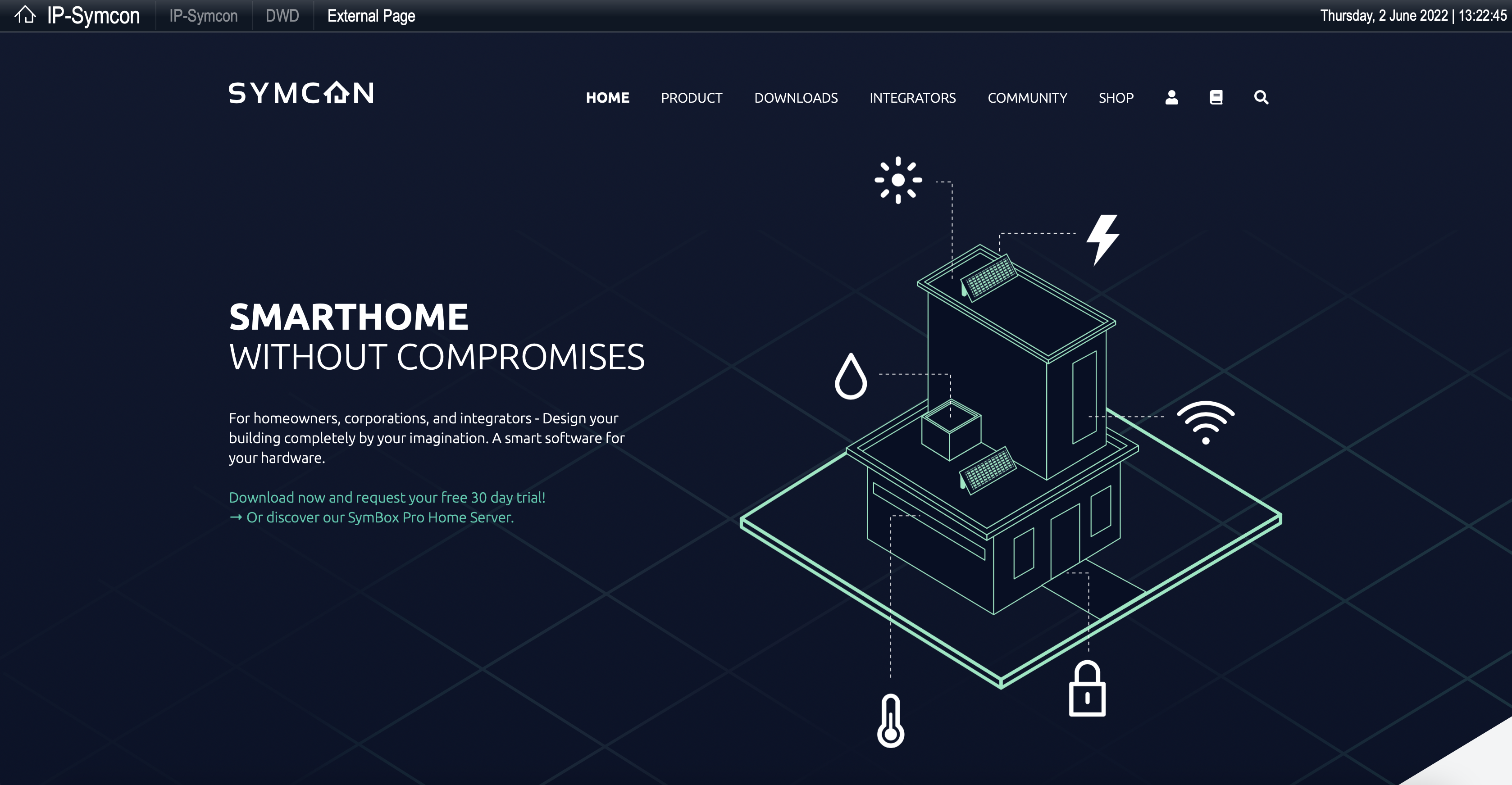
This item allows the display of external websites. Both locally stored pages and external websites can be displayed. It is also possible to have the page updated automatically at a certain interval.
### External Websites
External websites are specified in the normal URL format, e.g.: [https://www.symcon.de](https://www.symcon.de).
### Properties
* __Title:__ Title for the item in the TabPane navigation. By default, "External Page" will be displayed.
* __Icon:__ Icon that appears next to the title in the TabPane navigation. By default, no icon will be displayed.
* __URL:__ Specify the address of the page which content will be displayed.
* __Interval:__ Optionally, an automatic refresh interval for the page can be specified in seconds.
* __Security:__ Optionally, the Sandboxing option can be disabled. In some cases, this may cause the external page to disable your WebFront and to present itself in full size.
## Graph
Source: https://www.symcon.de/en/service/documentation/components/webfront-visualization/web/editor/graph/
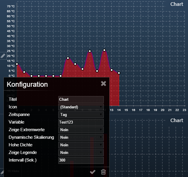
A full-screen graph will be shown directly in the [WebFront](webfront-visualization.md).
A single logged [variable](../concepts.md) or a [chart object](../concepts.md) can be presented.
### Properties
* __Title:__ Title for the item in the TabPane navigation. If no individual name is specified, the object name of the selected variables will be displayed.
* __Icon:__ Icon that appears next to the title in the TabPane navigation. By default, no icon will be displayed.
* __Period of Time:__ The display area of the graph can be set to hour, day, week, month, or year.
* __Variable:__ Here a logged variable or chart media file to be displayed can be selected.
* __Show extreme values:__ This option specifies whether the graph is displayed with or without extreme value curves, if available.
* __Dynamic Scaling:__ If the dynamic scaling is enabled, the graph will be dynamically scaled according to the minimum and maximum values in the time range. Otherwise, scaling will be performed according to the minimum and maximum specified in the variable profile of the selected variable.
* __High Density:__ Increases the data point density, which makes the graph more accurate. Works only with line charts or logged variables on "Standard" -Logging.
* __Show legend:__ Turn the legend on / off.
* __Intervall (sec):__ The displayed graph will be automatically updated in seconds according to the interval set here. By default, this happens every 300 seconds.
## Idle Widget
Source: https://www.symcon.de/en/service/documentation/components/webfront-visualization/web/editor/idle-widget/
The Idle Widget offers the possibility to create an invisible timer in the widget area of a TabPane. This is visible only in the editor mode and changes the displayed page after a defined inactivity time.
> **Warning:** [SplitPanes](webfront-visualization.md) and the [TabPane](webfront-visualization.md) itself can not be jumped directly. These are purely cosmetical elements. However, elements within the [SplitPane](webfront-visualization.md) or [TabPane](webfront-visualization.md) can be selected as target, e.g., added categories.
### Properties
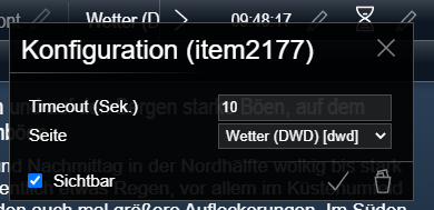
* __Timeout (sec):__ The current page will be changed to the target page after the defined time of inactivity.
* __Page:__ The target page that is selected when the Idle Widget triggers.
## Info Widget
Source: https://www.symcon.de/en/service/documentation/components/webfront-visualization/web/editor/info-widget/
The Info-Widget offers the possibility to display in the widget - area of a TabPane, a fixed icon, a dynamic icon for a variable or a textual variable value. In addition, a script can be selected that will be executed by clicking on the widget.
### Display Variants
| Icon - Display | Text presentation |
| ------------------------------------ | ------------------------------------ |
|  |  |
* A fixed icon can be selected in order to display the Icon property. It should be noted that neither type nor variable may be specified.
* A dynamic icon will be displayed when a variable is specified and type is set to Icon. Which icons will be displayed and which icons are available by default is described under [Icons](icons.md). If the "transparent" icon is displayed, then the widget is hidden. In this way, information - icons can be dynamically inserted, e.g.: when a device needs a battery change.
* The current variable value is formatted textually using the [variable profile](../concepts.md) associated with the variable if a variable is specified and the type is set to text.
### Properties
* __Icon:__ Here a fixed icon can be selected for display.
* __Type:__ The type determines whether a variable should be displayed as text or as an icon.
* __Variable:__ Here you can select a variable that will be displayed according to the selected type.
* __When clicking:__ A script, which is executed by clicking on the widget, can be set here.
## Content Changer
Source: https://www.symcon.de/en/service/documentation/components/webfront-visualization/web/editor/content-changer/
The Content Changer is used to display the following objects:
* Email-instances ([IMAP](../modules/imap.md), [POP3](../modules/pop3.md))
* String-variables with variable profile [~TextBox](object-presentation.md) or [~HTMLBox](object-presentation.md)
* Media-objects of the type [Image](../concepts.md) or [Streams](../concepts.md)
### Presentation
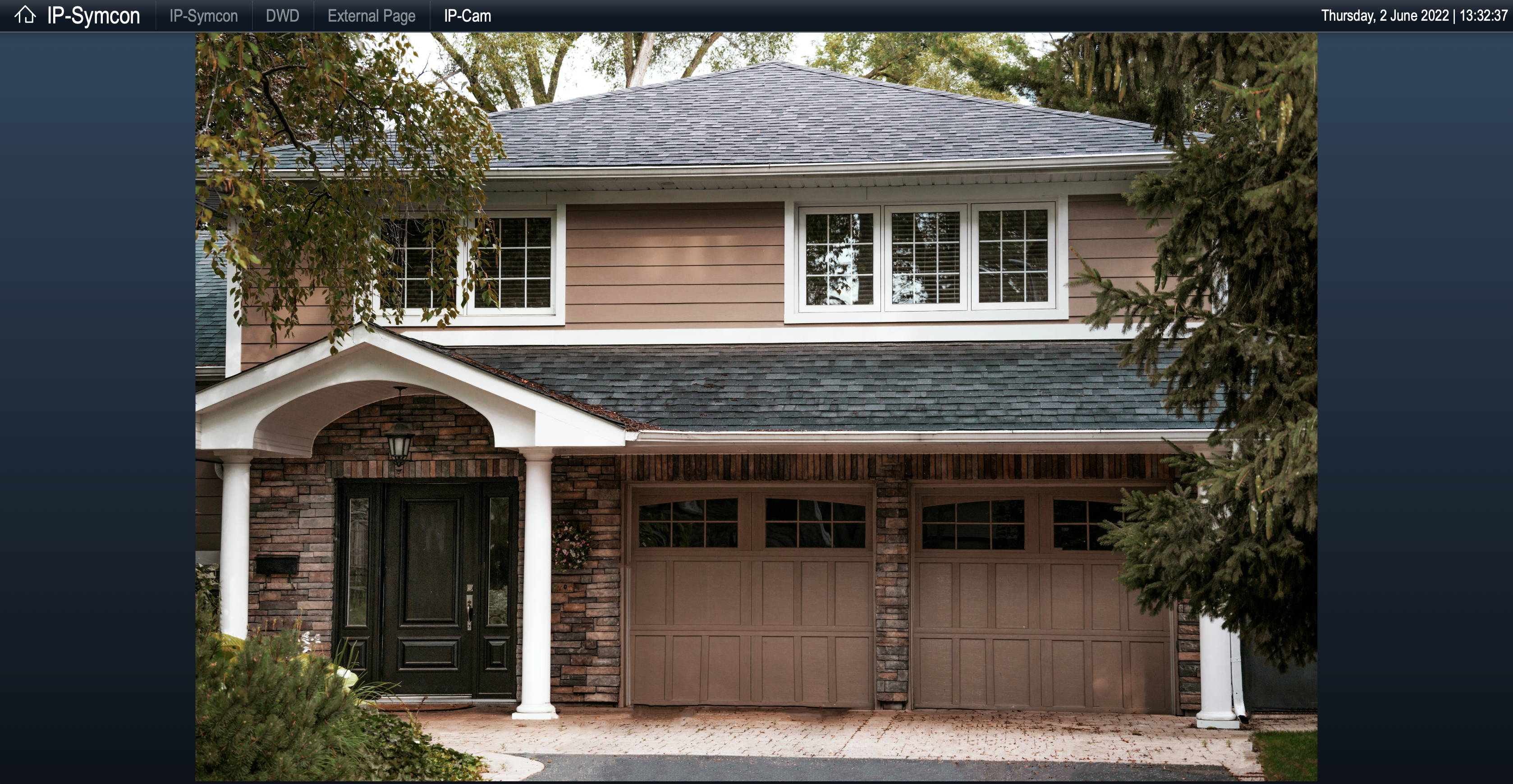
If a displayable object is selected as source object in the configurator, only that object will be displayed. Otherwise, all displayable immediate child objects of the selected source object will be selected for display. If more than one displayable child object is found, a selection list for switching between the child objects will be displayed. For editable string variables of Type ~TextBox, a button will also be displayed to call the on-screen keyboard in order to edit the text. Switching between the objects to be displayed can also take place automatically if a change interval is specified.
### Properties
* __Title:__ Title for the item in the TabPane navigation. If no individual value is specified, the name of the selected object is shown.
* __Icon:__ Icon that appears next to the title in the TabPane navigation. By default, no icon will be displayed.
* __Source object:__ The object that is displayed directly or whose child objects are shown.
* __Change interval:__ Interval in seconds, in which automatic switching takes place between the displayed objects. The default value "0" disables the function.
* __Upscale:__ _This option indicates, whether images to be displayed are automatically scaled up when space is available. By default, it is not scaled up.
* __Downscale:__ If this option is activated, images will be automatically downscaled if there is not enough space available. The option is enabled by default.
* __Maintaining the aspect ratio:__ If scaling up or downscaling is enabled, this option allows you to set whether or not to maintain the aspect ratio of the scaled images when scaling. By default, the aspect ratio will be maintained.
## Category
Source: https://www.symcon.de/en/service/documentation/components/webfront-visualization/web/editor/category/
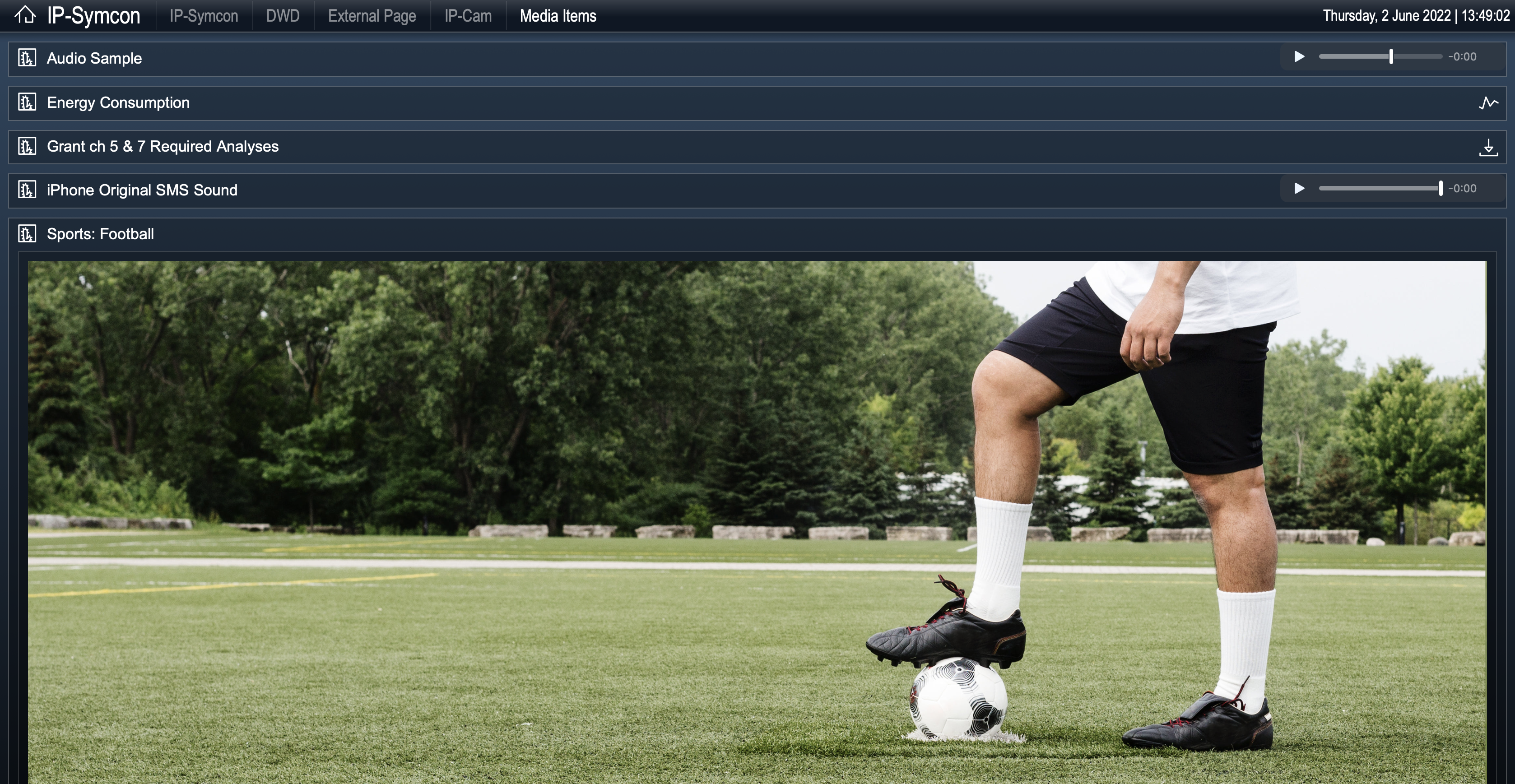
The category element allows the display of objects that can be found in a category as well as the navigation in subcategories.
### Object area
The object area displays the child objects of the selected category. Further information and possible display modes can be found in the [Object Presentation](object-presentation.md) area.
### Navigation bar
If the displayed category has visible subcategories, a navigation bar with subcategories will be displayed automatically. If a subcategory is selected in the navigation, its content will be displayed in the object area. If a category displayed in this way also has visible subcategories, the navigation will be expanded automatically. Naturally, categories that were linked via [Link object](../concepts.md) will also be displayed in the navigation bar. The "Show Navigation" property can be used to hide the category bar if required.
### Properties
* __Title:__ Title for the item in the TabPane navigation. If no individual value is specified, the name of the selected object will be displayed automatically. If the value is set, but the text is left in blank, the title will not be displayed.
* __Icon:__ Icon that appears next to the title in the TabPane navigation. By default, no icon will be displayed.
* __Start category:__ Category whose content will be represented by the element. By default, the main category will be displayed as "ID 0".
* __Show Navigation:__ This option defines that the navigation bar is displayed, provided there are subcategories below the start category. By default, the navigation bar will be displayed.
### Special features
* If the title is set to an empty text and no icon is specified, the category module won´t be displayed in the navigation, but it remains accessible via [WFC_SwitchPage](../modules/webfront-visualization.md).
* If a category should be displayed in WebFront with icon but without title, a space must be entered in the title (" ").
## Logout Widget
Source: https://www.symcon.de/en/service/documentation/components/webfront-visualization/web/editor/logout-widget/
The Logout Widget offers the option of displaying a button in the widget area of a TabPane. When used, one will be brought back to the WebFront login.
### Properties
* __Timeout (sec.):__ Timeout, which automatically logs out in the event of inactivity. If the value = 0, it is switched off.
## TabPane
Source: https://www.symcon.de/en/service/documentation/components/webfront-visualization/web/editor/tabpane/
The TabPane is an element that allows navigation between all other types of elements as well as displaying widgets.
### Representation
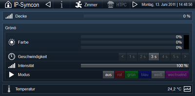
At the top of the TabPane there is a navigation bar, with a content area below. In the navigation bar on the left side, if selected, the _"sub-icon"_ and the _"subtitle"_ are displayed first. Right next to it follows the navigation area, which displays the clickable fields for all TabPane child elements with their icon and title, if set. Clicking on a field, displays the content of the associated element in the content area. At the left edge of the navigation bar the is the widget area, which displays all widgets that are children of the TabPane.
The TabPane is typically used as the topmost element of a WebFront configuration because of the navigation capabilities it provides. Of course, a TabPane can also include more TabPanes.
If the image width is insufficient to display all navigation fields, clickable arrows will be displayed automatically to scroll within the navigation area. In this case, the width of the navigation area is reduced to 100 pixels. Next, the widget area is shortened.
### Properties
* __Title:__ Title of the TabPane in the navigation of possible parent TabPanes. By default, "Tab Pane" will be displayed.
* __Icon:__ Icon that is displayed next to the title in the navigation of possible parent TabPanes. By default, no icon will be displayed.
* __Subtitle:__ Text that appears at the left edge of the navigation bar. By default, no text is displayed.
* __Subicon:__ Icon that appears at the left edge of the navigation bar. By default, no icon is selected.
## SplitPane
Source: https://www.symcon.de/en/service/documentation/components/webfront-visualization/web/editor/splitpane/
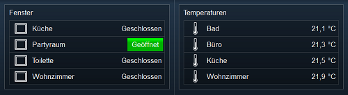
The SplitPane is a layout element that can split two sub-elements horizontally or vertically. In this way it is possible to display, for example a Content Changer with camera views next to a category. As SplitPanes and other layout elements such as other SplitPanes and TabPanes can be inserted below, infinite and individual layout adjustments are possible.
### Subdivision of sub-elements
The "Subdivision" property allows you to set whether the two sub-elements of the SplitPane should be displayed one above the other (horizontal division) or side by side (vertical division). The available space for each sub-element is defined by the properties _"Size"_, _"Size unit"_ and _"Ratio Target"_. _"Ratio Target"_ defines whether the first or second sub-element should be configured via _"Size"_ and _"Size unit"_. The target element is then assigned the space specified by the _"Size"_ property in the set _"Size unit"_.
### Example
An image with a picture width of 640 pixels should be displayed to the right side of a category. In order to do this, you assign the vertical value to the SplitPane property, set the _"Ratio target"_ to the second element, _"Size"_ to 640, and _"Size unit"_ to pixel. Now create a sub-element of type category and a sub-element of type content changer in the WebFront configurator below the SplitPane. For the sub-elements, the position should be set so that the category Position 0 and the content changer are given Position 1. Now the sub-elements can be configured to display the desired category and image.
### Properties
| Property | Description |
| ------------ | ------------------------------------------------------------------------------------------------------------------------------------------------------------------------------------------------------------- |
| Title | Title for the item in the TabPane navigation. By default, "SplitPane" will be displayed. |
| Icon | Icon that appears next to the title in the TabPane navigation. By default, no icon will be displayed. |
| Subdivision | Here you can select whether the division of the two sub-elements should be horizontal or vertical. By default, it is divided horizontally. |
| Size | The size of the sub-element selected for the division according to the size unit. The default value is 50. |
| Size unit | Here you can select whether the size refers to percent or to pixels. By default, percent will be taken. |
| Target ratio | This property allows you to choose whether the first or the second sub-element of the SplitPane will be displayed according to the specified size specification. By default, the first item will be selected. |
| Show margin | With this property, it can be defined whether if a margin should be shown to separate the sub-elements. By default, the margin is shown. |
## Time Widget
Source: https://www.symcon.de/en/service/documentation/components/webfront-visualization/web/editor/time-widget/
The Time Widget allows you to view the current date and time in the widget area of a TabPane. If no custom display format is set, the presentation depends on the language set in the web browser. You can choose between the standard formats "Hidden", "Short", "Medium", "Long" and "Complete" for the date format and the time format. A custom format can be entered, according to the datePattern-table at [dojotoolkit.org/reference-guide/dojo/date/locale/format.html](http://dojotoolkit.org/reference-guide/dojo/date/locale/format.html).

### Properties
* __Date format:__ A predefined pattern for date formatting the can be selected here.
* __Time format:__ Like date formating, a predefined pattern for time formatting can be selected here.
* __User-defined format:__ Optionally, a custom format can be specified here.
## Weather (DWD)
Source: https://www.symcon.de/en/service/documentation/components/webfront-visualization/web/editor/weather-dwd/
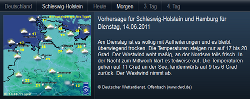
The weather element allows displaying the weather forecast of the German Weather Service for Germany and the individual federal states in text and image.
### Navigation Bar
The navigation bar is located in the upper area. If the property "Region" is set, you can switch between the weather report for Germany and the selected state. In addition, the forecast period can be changed between today, tomorrow, 3rd day and 4th day.
### Forecast Area
In the forecast area, the forecast text is shown on the right and an appropriate weather map on the left.
### Properties
* __Title:__ Title for the item in the TabPane navigation. By default, "Weather" will be displayed.
* __Icon:__ Icon that appears next to the title in the TabPane navigation. By default, no icon will be displayed.
* __Region:__ Optionally, a federal state can be selected here, its weather forecast can be displayed instead of the Germany-wide forecast in the navigation bar.
## Security
Source: https://www.symcon.de/en/service/documentation/components/webfront-visualization/web/security/
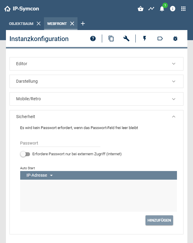
In this tab a password query for the WebFront and its editor can be set up.
Further security information can be found under [Security](../getting-started.md) .
### Enable editor
Activates the WYSIWYG editor. This option is enabled by default for a fast initial setup and configuration. If the setup is finished, the editor should also be disabled.
The editor will be likewise protected by the password set here.
> **Warning:** Hidden objects are invisibly loaded into the WebFront and can therefore be viewed, for example to via the developer console of the web-browser with the appropriate know-how. This is not an error, but a necessity to realize a rapid change in the visibility through the command [IPS_SetHidden](../functions/management-objects.md). As soon as the WYSIWYG editor is activated in the WebFront Configurator, the complete object tree is transferred, for example to realize the start/home category selection. This enables anyone with access to this WebFront to change the start category. After a successful use of the WYSIWYG editor, this should therefore be deactivated in the WebFront configurator.
### Required password
For each configurator, a password can be assigned as access protection. This password is required before accessing the respective configurator, or during the configuration within the mobile apps. In addition, the special option can be activated, in which the password is not required within the local network. This password is only valid for accessing the system and its components. The query of the available configurators (Mobile) and the WebFront start page (overview) it is available at any time without a password.
### Autostart for IP-address
A special function is the autostart, which opens a configurator directly without a password request if the IP address matches one of the entered IP addresses in this list. This function can be used for example to open a WebFront directly on a touch panel without having to display the normal selection dialog and without having to answer the password prompt. It is important to remember to use this feature only within a secure network.
> **Note:** Since IP-Symcon 5.5 the CIDR notation is also supported. For example, 192.168.1.0/24 includes all addresses from 192.168.1.1 to 192.168.1.255.
> **Warning:** This function is not available if IP-Symcon is accessed via a Reverse Proxy or the Connect Service as the origin cannot be verified securely. An exception is the CIDR value Wert 0.0.0.0/0, which forwards all requests, independently of the origin.
#### Call via URL
There are some situations (e.g., in connection with NAT) when autostart via IP is not working. In these cases a URL with the WebFront password can be used.
```php
// Basic framework for a call via URL
http://:3777/?password=#
// Example by starting with the Chromium Browser
// Password: "secret", WebFrontInstanceID: = 12345
chromium-browser --start-fullscreen 192.168.1.123:3777/?password=secret#12345
```
> **Warning:** There is a security risk, because the URL is visible and includes the WebFront password as plain text.
## Structure (deprecated)
Source: https://www.symcon.de/en/service/documentation/components/webfront-visualization/web/structure/
> **Warning:** This functionality is only avaiable until version 4.4 avaiable. It was replaced in total by the [editor](webfront-visualization.md).
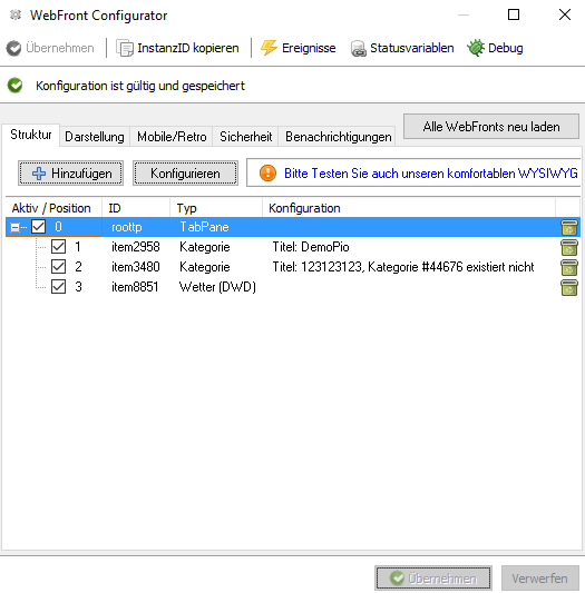
The configurator can contain __elements__, which start in the visualization as a tab from the top left margin and additionally contain __widgets__, which start in an extra area at the top right margin. This area is similar to the SysTray of Windows.
An element or widget can be inserted via the __Add__ button and configured accordingly. An element consists of a unique ID that is automatically assigned, a position, and a configuration corresponding to the element.
The ID can be defined by the user when the same is created, so that the element can be better recognized during actions. The ID has no relation to the objectIDs of the instances or variables.
The position indicates the position in the tab or the widget bar and must have a value greater than or equal to zero. If two elements have the same position number, the order is defined by the title of the element.
### Overview of available elements
| Element | Description |
| ------------------------------------------------------ | ------------------------------------------------------------------------------------------------------------------------------------------------------------------------------------------------------------------------------------------------------------------------------------------------------- |
| [Category](../concepts.md) | This element displays a category and all its sub-objects in the WebFront. The ID of the category to be displayed can be changed through the start category parameter. |
| [Graph](webfront-visualization.md) | With this element, the graphs set in the Archive Module are displayed directly. Normally, graphs can be called using the icon located at the left of the value of the variable. If graphs should be embedded directly, for example in TabPanes or SplitPanes, this can be done using the graph element. |
| [External Page](webfront-visualization.md) | This element inserts an external site in the WebFront via an IFrame. The URL parameter and interval are available. |
| [Content Changer](webfront-visualization.md) | The Content Changer allows you to switch multiple media files, strings, HTMLBoxes, StringBoxes, mail instances, or external sites within a single page. |
| [SplitPane](webfront-visualization.md) | Using the SplitPanes (formerly Container), the WebFront view can be split into two parts and any other element can be inserted in each part. Thus, if SplitPanes are inserted in SplitPanes, a QuadView can be simulated. |
| [TabPane](webfront-visualization.md) | TabPanes can be used to create custom menu bars at the upper area, which refers to other items. |
| [Weather (DWD)](webfront-visualization.md) | Displays the weather of the DWD with the ability to select specific areas of Germany and to switch between a normal image or a radar image. |
| [Time Widget](webfront-visualization.md) | Displays the current time. |
| [Info Widget](webfront-visualization.md) | Can either be used to display a static icon or linked to a variable which content / icon is displayed. |
| [Logout Widget](webfront-visualization.md) | This element adds a widget with which you can return to the WebFronts selection screen. |
| [Idle Widget](webfront-visualization.md) | This element adds an invisible widget, which switches to a specific page after a period of inactivity. |
## Mobile
Source: https://www.symcon.de/en/service/documentation/components/webfront-visualization/mobile/
The mobile visualization for mobile devices can be downloaded from the respective AppStore. There, the latest description of the functions of the app can be found as well. (__Android:__ [IP Symcon Mobile on Google Play](https://play.google.com/store/apps/details?id=de.symcon.visualization) / __iOS:__ [IP Symcon Mobile for iPhone, iPod touch, and iPad in the iTunes App Store](https://apps.apple.com/us/app/symcon-visualization/id1566124129) )
This page is intended to be a description and reference for frequently asked questions and functions that differ between the apps. Furthermore, no app is eligible for full compatibility with the WebFront. These serve as an extension to IP Symcon for quick and easy access to the basic functions of the system. For a complete visualization the WebFront can and must be used. No change is planned here as the mobile applications would become slower with ever-increasing functions. But that would collide with the main feature "speed".
The documentation for the push messages can be found in the section [Notification Control](../modules/notification-control.md)
> **Warning:** It should be noted that access to the system via the mobile apps is deactivated by default. It is indicated by the error message "No valid configurator!". In the desired WebFront Configurator mobile use must be activated.
### Functions that are intentionally unavailable
* User-defined icons are not loaded, as this would mean a considerable loss of speed, which would be further decreased as several icon sizes would be required, for example, for the Retina display, which only few users have at hand.
* Multiple nesting is not available. The aim is to make optimum use of the display area on mobile devices.
### Functions that differ from the WebFront
* Boolean-variables are shown as on/off (switch, checkbox) by default. This can be managed in through the WebFront visualization instance, so only ~Switch profils have this representation.
### WebFront Release Link
The app can be started directly and linked to a WebFront via WebFront release links.
If the corresponding WebFront does not exist in the app, a configurator will be set up automatically.
There are 2 types of links:
For servers without SSL: __symcon://www.webfront.info/#98765__
For servers with SSL: __symcons://my.ssl-server.com/#12345__
If the server/configurator is not in the app list, it will be added and opened automatically.
Thus, for example, without manual settings being necessary, the visitor at home or even the conference participant can be given quicker access to the local WebFront.
### Known bugs
* When SSL is enabled, externally loaded content (such as images) can not be loaded if the certificate is not accepted by the browser.
* Certain profiles and status/variables (for example HomeMatic Window Contacts or LCN Relays) can be switched in the Mobile App. This possibility of the action is displayed in color (green/red) in the WebFront and means that either an action script is defined or that a standard action is available. If the behavior is to be changed, this topic gives the corresponding answer in the forum: [Changeability of Fixed Variables](https://community.symcon.de/t/veraenderbarkeit-von-unveraenderlichen-variablen/24061)
### Hints
* If a JSON error occurs while loading, check if at least IP-Symcon 3.1 #3367 has been installed.
## Legacy Icons
Source: https://www.symcon.de/en/service/documentation/components/webfront-visualization/legacy-icons/
> **Note:** The WebFront uses the Legacy Icons and not the usual icons of the tile visualization.
### Icon type
It is differentiated between ‘normal’ and ‘adaptive’ icons. Normal icons do not change their appearance, whereas adaptive icons adapt their appearance to the set variable, depending on the value.
In this way, adaptive icons orientate themselves around the min/max values set in the profile. These are handled as 0-100%. Should it be handled as 100-0%, the term ‘.Reversed’ must be entered into the profile name.
Individual adaptive icons (e.g. Intensity-25), can also be entered directly and are then integrated as a ‘normal’ icon.
### Customized Icons included
From version IP-Symcon 3.0, customized icons are integrated via skins.
Further information can be found in the developer’s area as SDK: [Skins SDK](../developer/sdk-tools.md)
### Selection in the Management Console
The icon selection in the management console is optimised for the current icons. Still, the legacy icons can be chosen by entering the icon name manually into the corresponding field.
### Icon overview
The following icons are contained in WebFront and can be selected at the relevant locations in IP-Symcon. A special case is the icon __Transparent__. If that icon is selected, other icons of lower in rank (see above) are not displayed. This style element can be used in order to, e.g., not display an icon of a linked category object, even though the category has an icon.
### Icons
`aircraft`, `alert`, `arrowRight`, `backspace`, `basement`, `bath`, `battery`, `bed`, `bike`, `book`, `bulb`, `calendar`, `camera`, `car`, `caret`, `cat`, `climate`, `clock`, `close`, `closeall`, `cloud`, `cloudy`, `cocktail`, `cross`, `database`, `dining`, `distance`, `doctorBag`, `dog`, `doll`, `dollar`, `door`, `download`, `drops`, `duck`, `edit`, `electricity`, `energyProduction`, `energySolar`, `energyStorage`, `erlenmeyerFlask`, `euro`, `execute`, `eyes`, `factory`, `favorite`, `female`, `fitness`, `flag`, `flame`, `floorLamp`, `flower`, `fog`, `garage`, `gas`, `gauge`, `gear`, `graph`, `groundFloor`, `handicap`, `heart`, `help`, `hollowArrowDown`, `hollowArrowLeft`, `hollowArrowRight`, `hollowArrowUp`, `hollowDoubleArrowDown`, `hollowDoubleArrowLeft`, `hollowDoubleArrowRight`, `hollowDoubleArrowUp`, `hollowLargeArrowDown`, `hollowLargeArrowLeft`, `hollowLargeArrowRight`, `hollowLargeArrowUp`, `hourglass`, `houseRemote`, `image`, `information`, `intensity`, `internet`, `ips`, `jalousie`, `key`, `keyboard`, `kitchen`, `leaf`, `light`, `lightning`, `link`, `lock`, `lockClosed`, `lockOpen`, `macro`, `mail`, `male`, `melody`, `menu`, `minus`, `mobile`, `moon`, `motion`, `move`, `music`, `network`, `notebook`, `ok`, `pacifier`, `paintbrush`, `pants`, `party`, `people`, `plug`, `plus`, `popcorn`, `power`, `presence`, `radiator`, `raffstore`, `rainfall`, `recycling`, `remote`, `repeat`, `return`, `robot`, `rocket`, `script`, `shift`, `shower`, `shuffle`, `shutter`, `sink`, `sleep`, `sleet`, `snow`, `snowflake`, `sofa`, `speaker`, `speedo`, `stars`, `sun`, `sunny`, `tV`, `talk`, `tap`, `teddy`, `tee`, `telephone`, `temperature`, `thunder`, `title`, `topFloor`, `tree`, `turnLeft`, `turnRight`, `umbrella`, `unicorn`, `ventilation`, `wC`, `warning`, `wave`, `wellness`, `windDirection`, `windSpeed`, `window`, `xBMC`
### Adaptive Icons
`aircraft`, `alert`, `arrowRight`, `backspace`, `basement`, `bath`, `battery-0`, `battery-50`, `battery-100`, `battery`, `bed`, `bike`, `book`, `bulb`, `calendar`, `camera`, `car`, `caret`, `cat`, `climate`, `clock`, `close`, `closeall`, `cloud`, `cloudy`, `cocktail`, `cross`, `database`, `dining`, `distance`, `doctorBag`, `dog`, `doll`, `dollar`, `door-0`, `door-100`, `door`, `download`, `drops`, `duck`, `edit`, `electricity`, `energyProduction`, `energySolar`, `energyStorage-0`, `energyStorage-25`, `energyStorage-50`, `energyStorage-75`, `energyStorage-100`, `energyStorage`, `erlenmeyerFlask`, `euro`, `execute`, `eyes-0`, `eyes-100`, `eyes`, `factory`, `favorite`, `female`, `fitness`, `flag`, `flame`, `floorLamp-0`, `floorLamp-100`, `floorLamp`, `flower`, `fog`, `garage-0`, `garage-25`, `garage-100`, `garage`, `gas`, `gauge`, `gear`, `graph`, `groundFloor`, `handicap`, `heart`, `help`, `hollowArrowDown`, `hollowArrowLeft`, `hollowArrowRight`, `hollowArrowUp`, `hollowDoubleArrowDown`, `hollowDoubleArrowLeft`, `hollowDoubleArrowRight`, `hollowDoubleArrowUp`, `hollowLargeArrowDown`, `hollowLargeArrowLeft`, `hollowLargeArrowRight`, `hollowLargeArrowUp`, `hourglass-0`, `hourglass-30`, `hourglass-60`, `hourglass-100`, `hourglass`, `houseRemote`, `image`, `information`, `intensity-0`, `intensity-25`, `intensity-50`, `intensity-75`, `intensity-100`, `intensity`, `internet`, `ips`, `jalousie-0`, `jalousie-50`, `jalousie-100`, `jalousie`, `key`, `keyboard`, `kitchen`, `leaf`, `light-0`, `light-1`, `light-25`, `light-50`, `light-75`, `light-100`, `light`, `lightning`, `link`, `lock-0`, `lock-100`, `lock`, `lockClosed`, `lockOpen`, `macro`, `mail`, `male`, `melody`, `menu`, `minus`, `mobile`, `moon`, `motion`, `move`, `music`, `network`, `notebook`, `ok`, `pacifier`, `paintbrush`, `pants`, `party`, `people`, `plug`, `plus`, `popcorn`, `power`, `presence-0`, `presence-100`, `presence`, `radiator`, `raffstore-0`, `raffstore-50`, `raffstore-100`, `raffstore`, `rainfall`, `recycling`, `remote`, `repeat`, `return`, `robot`, `rocket`, `script`, `shift`, `shower`, `shuffle`, `shutter`, `sink`, `sleep`, `sleet`, `snow`, `snowflake`, `sofa`, `speaker-0`, `speaker-1`, `speaker-25`, `speaker-50`, `speaker-100`, `speaker`, `speedo-0`, `speedo-25`, `speedo-50`, `speedo-75`, `speedo-100`, `speedo`, `stars`, `sun`, `sunny`, `tV`, `talk`, `tap`, `teddy`, `tee`, `telephone`, `temperature-0`, `temperature-25`, `temperature-50`, `temperature-75`, `temperature-100`, `temperature`, `thunder`, `title`, `topFloor`, `tree`, `turnLeft`, `turnRight`, `umbrella`, `unicorn`, `ventilation`, `wC`, `warning`, `wave`, `wellness`, `windDirection`, `windSpeed-0`, `windSpeed-30`, `windSpeed-60`, `windSpeed-100`, `windSpeed`, `window-0`, `window-100`, `window`, `xBMC`
> **Note:** The following icons are only available from IP-Symcon 5.0/Symcon Mobile 5.0: Bath, Bike, Book, Cloudy, Doll, Door, Download, EnergyProduction, EnergySolar, EnergyStorage, Favorite, Fitness, FloorLamp, Gas, Handicap, Heart, Help, Link, Menu, Pants, Party, People, Presence, Raffstore, Remote, Sink, Sleet, Sunny, Teddy, Tee, Thunder, Umbrella