Datalogging
and evaluation
Visualization
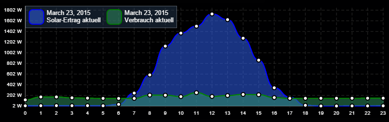
Visualize the change history of your sensors (e.g. temperatures, energy consumption or motion detection) with visually appealing graphs.
One Click Useability
Record the change history of a variable with just one click.
Automatic Visualization
Symcon automatically displays the course of changes in the most suitable way (line, boolean or bar chart).
Accuracy
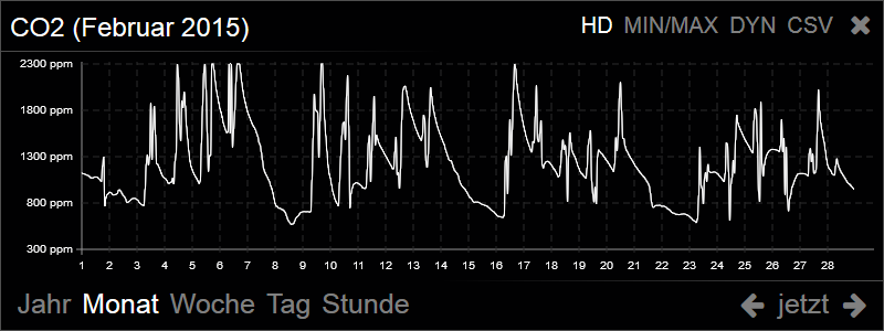
Use our “High Detail” feature to get exact values at any point in time. In this way, you can even recognize brief consumption peaks.
Clarity
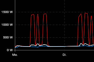
Display correlated value records within one multi-graphs. Find deviations or outliers at a glance. Our multi-graphs also allow the comparison of value developments from different time periods.
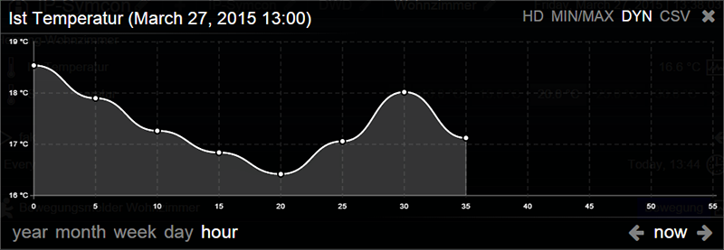
Line Charts
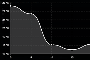
Line charts are particularly suitable for displaying continuously fluctuating values (e.g. temperatures, humidity).
Extrema
With the extrema option, the minimum and maximum values can also be made visible in line charts.
Bool Charts
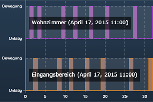
Boolean charts precisely visualize changes to boolean variables with steep edges.
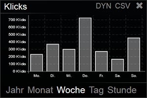
Bar Charts
Bar charts are suitable for visualizing continuously increasing values. In each case, only the value change is shown.
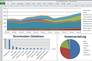
Excel Export
Export your recorded data to Excel or other CSV-compatible programs for further processing. There, you can use the data for further analysis and create individual visualizations.
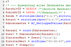
Komplexe Datenauswertung
With full access to all data via scripts, you can carry out complex data evaluations. In this way, correlations can be established between different data sets or different time periods. For example, the temperature loss after each ventilation can be calculated using recorded window contacts and temperature sensors.