Documentation
Charts
Charts can present one or more variables as graphs. Using variables in a chart requires that the variables are logged. Configuring the logging of variables is explained in the Archive Control.
Configuration in IP-Symcon
A new chart can be added via Right click -> "Add object" -> "Media" -> "Chart" at the selected location. The selected (logged) variables are used as data source for the individual graphs.
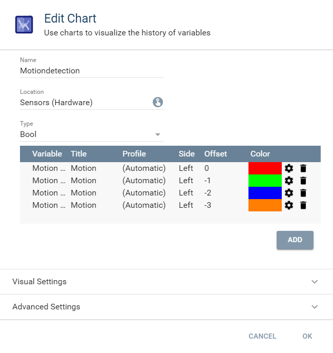
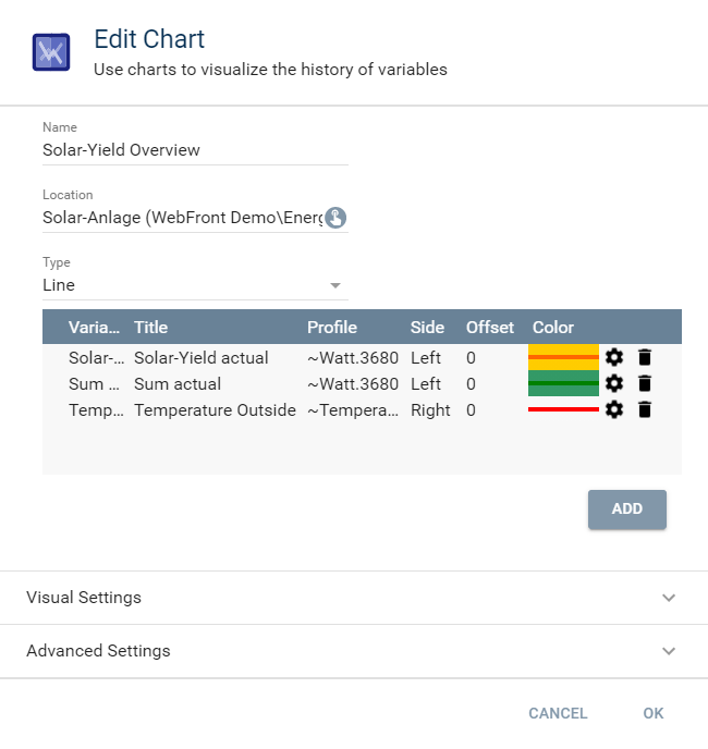
Edit chart
General properties of the chart.
| Option | Description |
|---|---|
| Add | Add a single variable -> Opens the "Configure graph" dialog. If a graph already exits, this dialog can be opened by clicking on the gear in the list |
| Name | Name of the Chart |
| Location | Selection of the location for the chart |
| Type | Selection the type of presentation as line, bar, or bool chart |
| Visual Settings | Here, the icon, visibility, and activation can be configured |
| Advanced Setting | A description can be provided here |
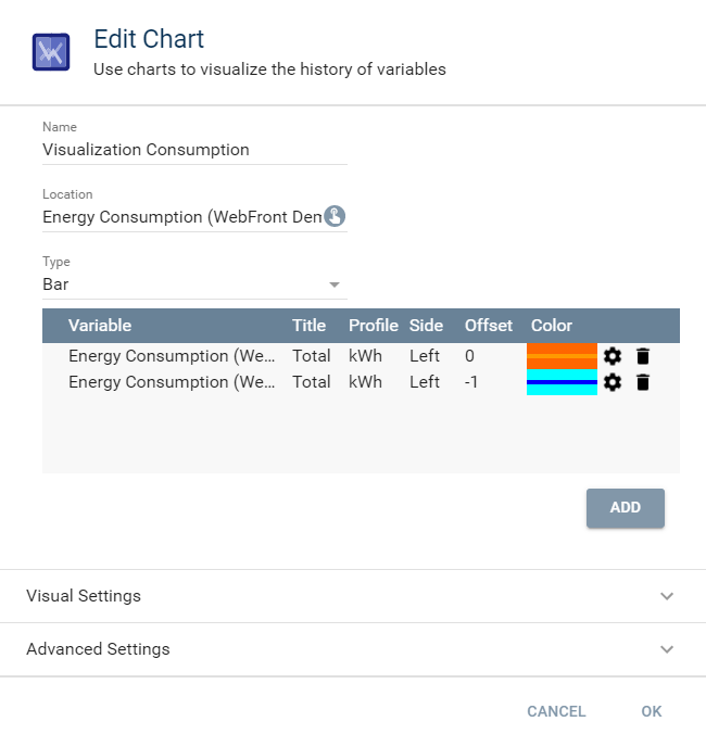
Configure graph
A graph represents a single dataset for the chart.
| Field | Description |
|---|---|
| Axis Profile | Selection of the Variable Profile . The defined Min and Max values are used for scaling the Y-axis (not available for Bool Chart) |
| Axis Side | Selection if the labels for this graph should be at the left or at the right (not available for Bool Chart) |
| Fill Color | Selection of the desired fill color - Transparency possible |
| Line Color | Selection of the desired line color |
| Offset | An offset by the respective time unit (see below for examples) |
| Title | Meaningful title which is shown in the legend. If the title is empty, the name of the variable is displayed |
| Variable | Selection of the displayed variable |
Display
Display as Popup Graph
To display a popup graph, the chart needs to be moved to the desired category in the object tree.
Display as Full Screen Graph
A full screen graph is displayed by adding the chart as graph element with the WebFront editor.
Additional Options for Presentation
Selectable options that can be activated within the graph to change the presentation.
| Abbreviation | Meaning | Description |
|---|---|---|
| CON | Continuous | The X axis is adjusted such that the right border is set to the most current value. This shows the biggest possible amount of current data |
| DYN | Dynamic | If activated: The Y axis is scaled according to the minimum and maximum value of the chart If deactivated: The borders of the Y axis are taken from the selected variable profile |
| HD | High Density | If activated: An increased precision of average values is used for the presentation of the graph. See table Average Intervals |
| Legend | Legend | (Charts only) (De-)Activates the legend |
| MIN/MAX | Min/Max | (Automatically generated graphs for variables only) Two additional graphs with the minimum and maximum values are shown |
| RAW | Raw data | If activated: The raw data is displayed. If deactivated: The aggregated values are shown |
Average Intervals
| Timespan | Regular | High Density (HD) |
|---|---|---|
| Decade | Years | Months |
| Year | Months | Days |
| Month | Days | Hours |
| Week | Days | Hours |
| Day | Hours | 5 minutes |
| Hour | 5 minutes | 1 minute |
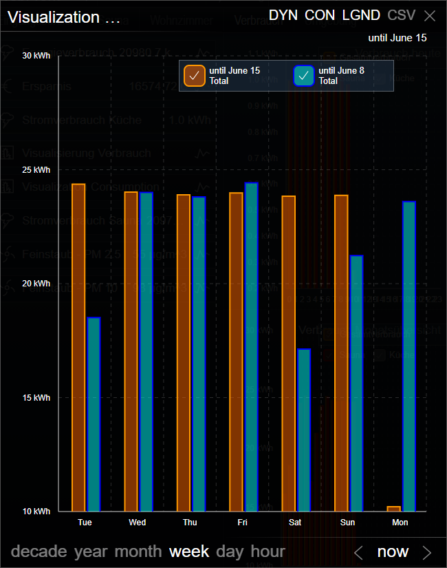
Example 1 (Type: Bar)
This example shows the comparison of energy costs of a heating system.
The same variable was chosen twice, but one (blue) uses a time offset of -1.
In the week presentation, a comparison between the current and the previous week is shown, in the year presentation, a comparison to the previous year, ...
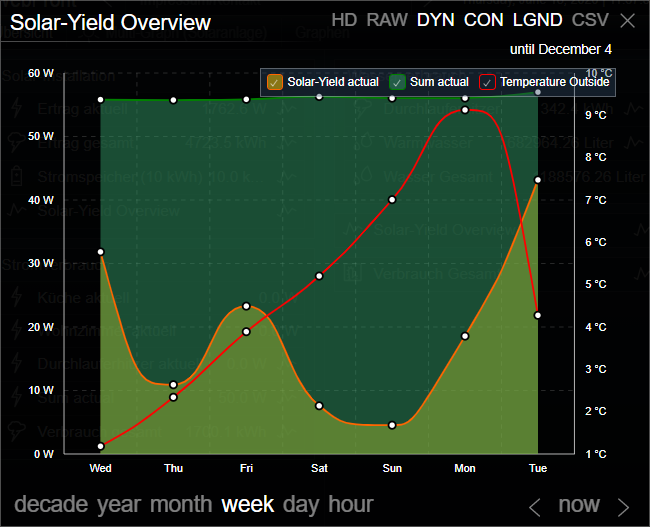
Example 2 (Type: Line)
This example displays the gain of a solar collector as well as a sum of the current consumption. The values for these two graphs can be read at the left axis. In addition the exterior temperature is integrated, which uses the right axis.
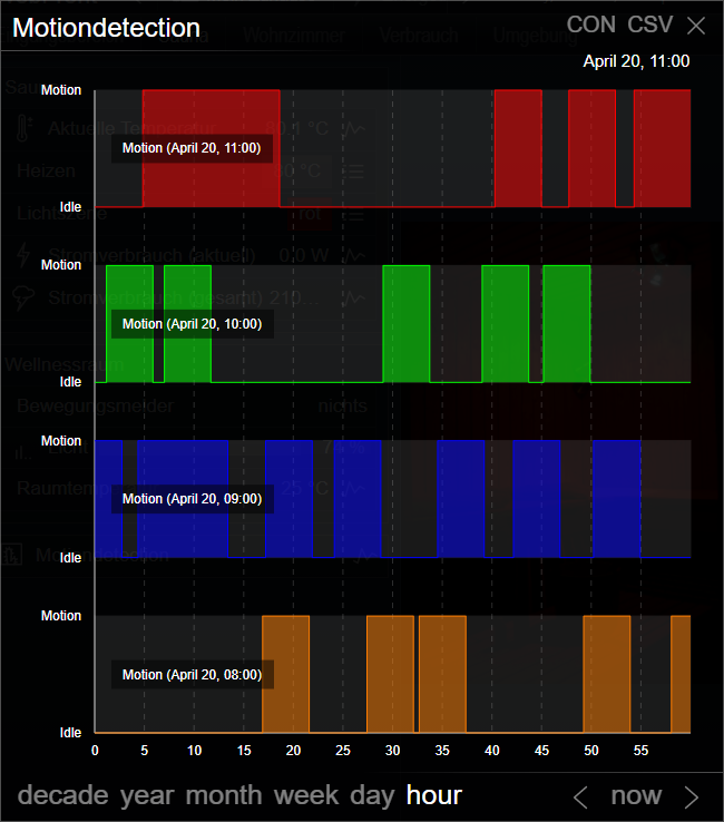
Example 3 (Type: Bool)
This example shows a bool chart that shows the state of a motion sensor over the course of four consecutive hours.