Documentation
Structure (deprecated)

This functionality is only avaiable until version 4.4 avaiable. It was replaced in total by the editor.
The configurator can contain elements, which start in the visualization as a tab from the top left margin and additionally contain widgets, which start in an extra area at the top right margin. This area is similar to the SysTray of Windows.
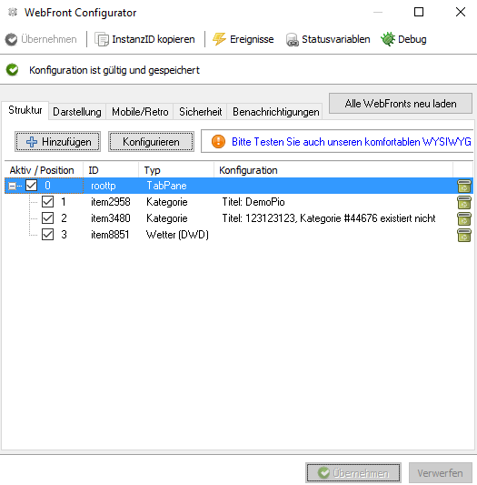
An element or widget can be inserted via the Add button and configured accordingly. An element consists of a unique ID that is automatically assigned, a position, and a configuration corresponding to the element.
The ID can be defined by the user when the same is created, so that the element can be better recognized during actions. The ID has no relation to the objectIDs of the instances or variables.
The position indicates the position in the tab or the widget bar and must have a value greater than or equal to zero. If two elements have the same position number, the order is defined by the title of the element.
Overview of available elements
| Element | Description |
|---|---|
| Category | This element displays a category and all its sub-objects in the WebFront. The ID of the category to be displayed can be changed through the start category parameter. |
| Graph | With this element, the graphs set in the Archive Module are displayed directly. Normally, graphs can be called using the icon located at the left of the value of the variable. If graphs should be embedded directly, for example in TabPanes or SplitPanes, this can be done using the graph element. |
| External Page | This element inserts an external site in the WebFront via an IFrame. The URL parameter and interval are available. |
| Content Changer | The Content Changer allows you to switch multiple media files, strings, HTMLBoxes, StringBoxes, mail instances, or external sites within a single page. |
| SplitPane | Using the SplitPanes (formerly Container), the WebFront view can be split into two parts and any other element can be inserted in each part. Thus, if SplitPanes are inserted in SplitPanes, a QuadView can be simulated. |
| TabPane | TabPanes can be used to create custom menu bars at the upper area, which refers to other items. |
| Weather (DWD) | Displays the weather of the DWD with the ability to select specific areas of Germany and to switch between a normal image or a radar image. |
| Time Widget | Displays the current time. |
| Info Widget | Can either be used to display a static icon or linked to a variable which content / icon is displayed. |
| Logout Widget | This element adds a widget with which you can return to the WebFronts selection screen. |
| Idle Widget | This element adds an invisible widget, which switches to a specific page after a period of inactivity. |