Documentation
TabPane
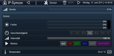
The TabPane is an element that allows navigation between all other types of elements as well as displaying widgets.
Representation
At the top of the TabPane there is a navigation bar, with a content area below. In the navigation bar on the left side, if selected, the "sub-icon" and the "subtitle" are displayed first. Right next to it follows the navigation area, which displays the clickable fields for all TabPane child elements with their icon and title, if set. Clicking on a field, displays the content of the associated element in the content area. At the left edge of the navigation bar the is the widget area, which displays all widgets that are children of the TabPane.
The TabPane is typically used as the topmost element of a WebFront configuration because of the navigation capabilities it provides. Of course, a TabPane can also include more TabPanes.
If the image width is insufficient to display all navigation fields, clickable arrows will be displayed automatically to scroll within the navigation area. In this case, the width of the navigation area is reduced to 100 pixels. Next, the widget area is shortened.
Properties
- Title: Title of the TabPane in the navigation of possible parent TabPanes. By default, "Tab Pane" will be displayed.
- Icon: Icon that is displayed next to the title in the navigation of possible parent TabPanes. By default, no icon will be displayed.
- Subtitle: Text that appears at the left edge of the navigation bar. By default, no text is displayed.
- Subicon: Icon that appears at the left edge of the navigation bar. By default, no icon is selected.