Documentation
PasswordTextBox
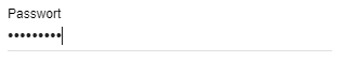
Creates an input field for passwords with the heading caption.
If created in the "Elements" area, the PasswordTextBox sets a property to the entered String when accepted.
The parameter "Name" defines which property is set.
Parameter
| Parameters | Description |
|---|---|
| caption | Visible caption of the password input field |
| enabled (optional) | (default: true) If true, the PasswordTextBox can be used, otherwise it is displayed as deactivated (since IP-Symcon 5.2) |
| name (optional) | Name of the password input field/the property to be set |
| onChange (optional) | (default: "") Script which is executed when the dropdown value is changed. If the script consists of several lines, the individual lines can also be defined as an array. It has the same properties as onClick of the Button. (since IP-Symcon 8.1) |
| type | PasswordTextBox |
| validate (optional) | (default: "") If the value does not meet the regular expression specified here, an error is displayed and changes cannot be accepted (since IP-Symcon 5.3) |
| value (optional) | (default: "") The value of the PasswordTextBox - If there is an associated property, this parameter is overwritten by the property in the elements area (since IP-Symcon 5.2) |
| visible (optional) | (default: true) If true, the image is visible, otherwise it is invisible (since IP-Symcon 5.2) |
| width (optional) | (default: 300px) Fixed width of the input field in pixels or % as a string, e.g. "40%" or "250px" (since IP-Symcon 5.3) |
Example
{ "type": "PasswordTextBox", "name": "Password", "caption": "Passwort" }