Documentation
List
Require: Symcon >= 4.2
Creates a list with the heading caption.
The displayed columns are defined in columns.
Initial entries in the list can be specified via values.
General Parameters
| Parameter | Description |
|---|---|
| add (optional) | (default: false) If true, an "Add" button is displayed below the table, which adds a new element with standard values to the table |
| caption (optional) | Visible caption of the list |
| columns | Columns of the list |
| delete (optional) | (default: false) If true, a button is displayed behind each entry in the list, which deletes the corresponding element |
| download (optional) | (default: "") If this parameter is not an empty string and the output of the onAdd, onChangeOrder, onDelete, onEdit or onSelectionChanged script is a Data-URL, the output is downloaded as a text file with the name of the download parameter. (since Symcon 7.0) |
| form (optional) | (default: based on the "edit" parameters of columns) An individual form for the dialog for adding and editing rows. The definition is done analogously to the definition of the form for Actions either statically as array of configuration elements or as PHP code, which can generate an individual form for every row. Use cases, sequence and examples are described in the section Individual Forms for Editing (since Symcon 7.0) |
| link (optional) | (default: false) If this parameter is true, the output of the onAdd, onChangeOrder, onDelete, onEdit or onSelectionChanged script is opened as a link. If it is false, the output is displayed as a dialog in the configuration form. (since Symcon 6.0) |
| multiAdd (optional) | (default: true, if neither onAdd nor form is set and only a single editable column with an object selection exists, otherwise false) The types SelectObject, SelectCategory, SelectEvent, SelectInstance, SelectLink, SelectMedia, SelectScript or SelectVariable count as object selection. If this parameter is true, adding an entry directly opens the object selection of the first visible column with an object selection, in which multiple objects can be selected at once. An entry is added for every selected object, whose further values receive their add value and can be adjusted via the dialog afterwards, see Adding Multiple Objects. When adding multiple objects, onAdd is still executed only once. If this parameter is false, adding an entry opens the dialog. However, if only a single editable column with an object selection exists and form is not set, the object selection for a single object is opened directly instead. (since Symcon 9.1) |
| name (optional) | Name of the list / the property to be set |
| onAdd (optional) | (default: "") Script which is executed after adding an entry to the list. If the script consists of several lines, the individual lines can also be defined as an array (arrays are supported since version 6.0). In this version, the list does not offer the currently selected entry as the variable value but the added entry instead, see Selected line as variable in on-Actions. Otherwise it has the same properties as onClick of the Button (since Symcon 5.3) |
| onChangeOrder (optional) | (default: "") Script which is executed after moving an entry within the list. If the script consists of several lines, the individual lines can also be defined as an array. In this version, the list does not offer the currently selected entry as the variable value but the moved entry instead, see Selected line as variable in on-Actions. Otherwise it has the same properties as onClick of the Button (since Symcon 6.3) |
| onDelete (optional) | (default: "") Script which is executed after deleting an entry in the list. If the script consists of several lines, the individual lines can also be defined as an array (arrays are supported since version 6.0). In this version, the list does not offer the currently selected entry as a variable value but the deleted entry instead, see Selected line as variable in on-Actions. Otherwise it has the same properties as onClick of the Button (since Symcon 5.3) |
| onEdit (optional) | (default: "") Script which is executed after editing an entry in the list. If the script consists of several lines, the individual lines can also be defined as an array (arrays are supported since version 6.0). In this version, the list does not offer the currently selected entry as a variable value but the edited entry instead, see Selected line as variable in on-Actions. Otherwise it has the same properties as onClick of the Button (since Symcon 5.3) |
| onSelectionChanged (optional) | (default: "") Script which is executed after the user has selected another row via click or arrow key. If the script consists of several lines, the individual lines can also be defined as an array. The list offers the newly selected row as the variable value. The script is not executed when the selection is removed or when the values are changed via UpdateFormField, see Reacting to the selection. Otherwise it has the same properties as onClick of the Button (since Symcon 9.1) |
| rowCount (optional) | (default: 0) visible number of lines; If there are more lines in the list, a scroll bar is displayed - if the value is 0, the list fills the remaining space available in the instance editor. Only one configuration item can get all of the remaining space. |
| sort (optional) | Sort the table. If this is not set, the list remains unsorted |
| type | List |
| values (optional) | Initial entries in the list |
| visible (optional) | (default: true) If true, the list is visible, otherwise it is invisible (since Symcon 5.2) |
| enabled (optional) | (default: true) If true, the list can be used, otherwise it is displayed deactivated (since Symcon 6.0) |
| changeOrder (optional) | (default: false) If true, the order of the entries can be changed using drag & drop. The sorting of the list according to columns, however, is not possible in that case. (since Symcon 6.0) |
| loadValuesFromConfiguration (optional) | (default: true) This parameter specifies whether the list should be filled with the values of the property, see Saving and loading lists . If the value is set to false, it is necessary for a successful review in the Module Store to fill the list in the interests of the user, see Review guidelines Point 13 (since Symcon 6.0) |
Parameters for Columns
| Parameter | Description |
|---|---|
| add (optional) | Initial value in this column for a newly added entry, necessary if add is set to true in the list. Alternatively, an object can be provided which generates the value automatically, see Parameters for add (since Symcon 9.1) |
| align (optional) | (default: "left") Alignment of the column (since Symcon 5.2) "left": Content is displayed left-aligned "center": Content is displayed centered "right": Content is displayed right-aligned |
| caption | Visible caption of a column |
| confirm (optional) | (default: "") Query text before an onClick action is performed. The action is only carried out if the query is confirmed with "Yes". If no query text is defined, the action is carried out directly (since Symcon 5.2) |
| download (optional) | (default: "") If this parameter is not an empty string and the output of the onClick script of this column is a Data-URL, the output is downloaded as a text file with the name of the download parameter. (since Symcon 7.1) |
| edit (optional) | Description of an editable element |
| link (optional) | (default: false) If this parameter is true, the output of the onClick script of this column is opened as a link. If it is false, the output is displayed as a dialog in the configuration form. (since Symcon 7.1) |
| name | Unique name of a column to refer to; the name must not be "rowColor", "editable" or "deletable", since these values are used for other functions, see Parameters for values |
| onClick (optional) | (default: "") Script which is executed when a field in this column is clicked. It has the same properties as onClick of the Button. The script is only executed if this field is not empty, i.e. 0, false or "" (since Symcon 5.2) |
| quickFilter (optional) | (default: false) If true, the text of this column is considered during the search via quick filter. Should the value be false for all columns, the quick filter is hidden. (since Symcon 7.2) |
| sortColumn (optional) | If sortColumn is set and sorted according to this column, the values of the column are compared with the name of this parameter instead of the values of this column |
| save (optional) | (default: true, if the element can be edited or add is an object for automatic generation, otherwise false) If true, the values of this column should be saved as module properties, see Save and load lists |
| visible (optional) | (default: true) If false, the column is not displayed |
| width | Width of the column in pixels, as a CSS string (e.g. "100px"); a single column may have the value "auto", which means that the width of this column uses the remaining available space |
Parameters for edit
| Parameter | Description |
|---|---|
| type | Type of representation, according to the possible entries: CheckBox, IntervalBox, NumberSpinner, PasswordTextBox, Select, SelectCategory, SelectColor, SelectEvent, SelectFile, SelectInstance, SelectLink, SelectMedia, SelectObject, SelectScript, SelectVariable, ValidationTextBox, List, Tree |
| Further parameters | The other parameters depend on the type selected; the parameters "name" and "caption" of the type are ignored |

If the "type" List or Tree is used, the value of this column is not JSON-coded again. It is only necessary to parse the value of the higher-level list once. Each sub-list or subtree is then directly available as an object. Similarly, the values in "values" do not have to be coded twice.
The "add" parameter of the column is translated according to the localization, provided the "type" of "edit" is ValidationTextBox or PasswordTextBox or "edit" is not set at all
It is possibly to update only specific parts of columns or values with the function UpdateFormField by using a dot notation. In this case, the target is provided as columns.x.y or values.x.y. x refers to the index of the affected column or value and y refers to the name of the updated field. It is also possible to update a single column or value completely by using columns.x or values.x as target. For example, updating the width of the second column can be done via $this->UpdateFormField('list', 'columns.1.width', '200px');.
Parameters for add
Instead of a fixed value, the parameter add of a column can also be an object which describes the strategy by which the value of a newly added entry is generated automatically (since Symcon 9.1). The value is generated when the entry is added and is treated like a regular value afterwards. The generated value is unique within the column: If a random value matches the value of an existing entry, a new value is generated. Generated values are not translated.
| Parameter | Description |
|---|---|
| strategy | Strategy of the generation: "increment": The highest numeric value of this column across all entries of the list is increased by step. Non-numeric values are ignored. If there is no numeric value yet, start is used or, without start, the value of step. If start is set, a value less than start is never generated (with a negative step never a greater one) "random-string": A random string of the characters a-z, A-Z and 0-9 with the length length "random-integer": A random integer between min and max "guid": A random GUID (UUID version 4), e.g. "{3F2504E0-4F89-4D3A-9A0C-0305E82C3301}" |
| step (optional) | (default: 1) Step by which the highest value is increased, only for the strategy "increment"; must be a number other than 0 |
| start (optional) | Value of the first entry and lower bound of all following values (upper bound with a negative step), only for the strategy "increment"; must be a number |
| length (optional) | (default: 32) Number of characters of the generated string, only for the strategy "random-string" |
| min (optional) | (default: 0) Lower bound (inclusive) of the random integer, only for the strategy "random-integer"; must be less than max |
| max (optional) | (default: 2147483647) Upper bound (inclusive) of the random integer, only for the strategy "random-integer"; must be greater than min |
To keep generated values, columns with such an add value are saved by default, i.e. the parameter "save" is true by default for these columns. If a loaded entry is missing the value of such a column, e.g. because the column was added later, the value is generated by the same strategy when loading. The default value that on-actions receive when no entry is selected is generated by the strategy as well. If no unique value can be generated because all possible values are already in use, e.g. with "random-integer" and a small range between min and max, adding the entry fails with an error message.
// Columns with automatically generated values
{
    "caption": "ID",
    "name": "ID",
    "width": "50px",
    "add": { "strategy": "increment", "step": 10 }
}, {
    "caption": "Token",
    "name": "Token",
    "width": "auto",
    "add": { "strategy": "random-string", "length": 16 },
    "edit": { "type": "ValidationTextBox" }
}, {
    "caption": "Random number",
    "name": "Number",
    "width": "100px",
    "add": { "strategy": "random-integer", "min": 1, "max": 100 },
    "edit": { "type": "NumberSpinner" }
}, {
    "caption": "GUID",
    "name": "GUID",
    "width": "300px",
    "add": { "strategy": "guid" }
}
The strategy "increment" determines the next value from the current entries. If the entry with the highest value is deleted, its value is assigned again when the next entry is added. If a value should never be reused, e.g. because it serves as a permanent ID towards an external system, the module can remember the highest value ever assigned and specify it via start.
// Deleted IDs are not assigned again
public function GetConfigurationForm(): string
{
    $form = json_decode(file_get_contents(__DIR__ . '/form.json'), true);
    // The attribute HighestID is updated to the highest value of the list in ApplyChanges, but never decreases
    $form['elements'][0]['columns'][0]['add'] = ['strategy' => 'increment', 'start' => $this->ReadAttributeInteger('HighestID') + 1];
    return json_encode($form);
}
Parameters for sort
| Parameter | Description |
|---|---|
| column | Name of the column by which the list is sorted |
| direction | The direction of the sort; "ascending" for an ascending order and "descending" for a descending order |
Parameters for values
| Parameter | Description |
|---|---|
| deletable (optional) | (default: true) If false, the line cannot be deleted (since Symcon 5.4) |
| editable (optional) | (default: true) If false, the line cannot be edited, although the list itself has editable columns (since Symcon 5.4) |
| rowColor (optional) | (default: transparent) Background color of the line as hex code (default colors see below), empty string for transparency |
| icons (optional) | (default: {}) An object that contains the used icons for each column. Within the object, the key defines the name of the column and the value the name of the used icon. If there is no entry for a column, no icon is shown for that column. (since Symcon 9.0) |
| Further parameters (optional) | (default: "") For each initial entry in the list, the values for all columns are defined here. For this purpose, a parameter with the name of the column is entered for each column. The assignment of the parameter corresponds to the value of this column for the corresponding entry. |
| Color | Hex code |
|---|---|
| Light green | #C0FFC0 |
| Purple | #C0C0FF |
| Yellow | #FFFFC0 |
| Gray | #DFDFDF |
| Red | #FFC0C0 |
What the individual colors mean in messages and in the configurator can be read under the color codes for messages and configurators.
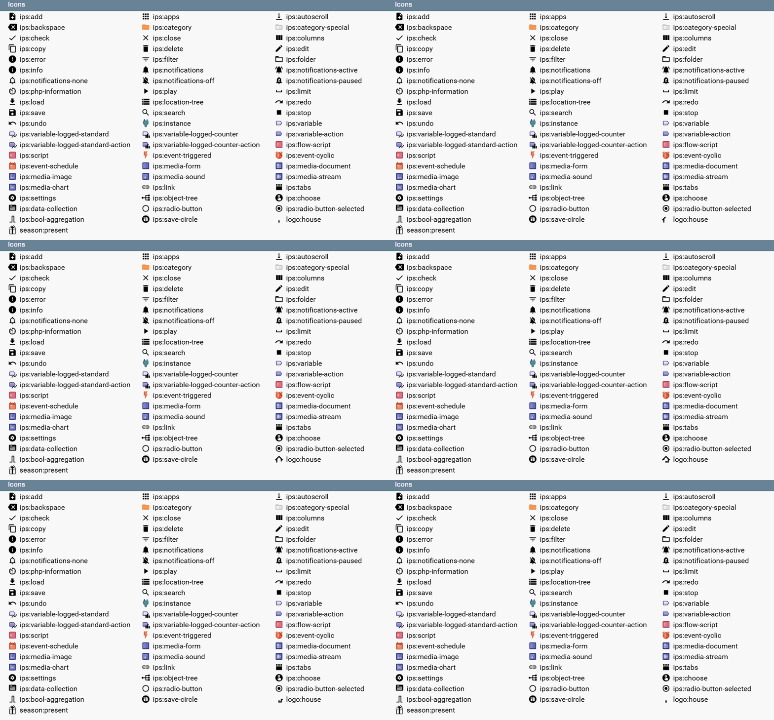
All icons supported by iron-icon are usable: Iron Icons Demo
In addition, the following Symcon specific icons can be used:
Saving and loading lists
When the list is saved, all list elements that can be edited or that have set the save parameter are saved as module properties.
If the list is reloaded and the parameter loadValuesFromConfiguration is not set to false, the values that were saved as module properties are entered first. If loadValuesFromConfiguration is set to false, values are not loaded from the property and only as described in the next steps. If values from the property should be used as basis anyway, they must be provided within the values. The other elements, including the color, are filled with the initial values from values.
If there are more lines than elements in values, elements of the superfluous lines that were not saved as module properties are filled with the initial value add of the corresponding column.
Selected Line as a Variable in on-Actions
In the definition of the configuration form, the values of the table can be used as the variable $Name. The object can be accessed like an array. If the corresponding object is accessed with a string index, the corresponding value is returned as defined in values of the selected line. If a numeric index is accessed or the object is iterated, the corresponding line is returned, the individual parameters of which can in turn be referenced by a string index.
Example:
// Output the name of the currently selected row in the devices table
{ "type": "Button", "caption": "Output", "onClick": "print_r($devices['name']);" }

// Output the name of the first line of the devices table
{ "type": "Button", "caption": "Output", "onClick": "print_r($devices[0]['name']);" }
Reacting to the Selection
Using the parameter onSelectionChanged, the module can react when the user selects another row of the list (since Symcon 9.1). Typical use cases are:
- Enabling buttons that refer to the selected row, e.g. "Test device"
- Showing details of the selected row in other form fields, e.g. in a Label
- Loading dependent data, e.g. the channels of the selected device in a second list
The values of the newly selected row are available as described in Selected line as variable in on-Actions via $(Name of the list)['Name of the column'], $id and all other form fields as usual. As the script is not executed within the module, it typically calls a function of the module, which adjusts the other form fields via UpdateFormField.
| Situation | onSelectionChanged |
|---|---|
| Click on another row | Is executed |
| Changing the row via arrow key | Is executed |
| Click on the row that is already selected | Is not executed |
| Removing the selection, e.g. by clicking on an empty area of the list or deleting the selected row | Is not executed |
| Adding, editing or moving a row | Is not executed, onAdd, onEdit or onChangeOrder are executed instead |
| Changing values via UpdateFormField | Is not executed. The selection stays at the same position if a row still exists there, otherwise it is removed |
The onClick of a column, on the other hand, is executed on every click on a non-empty field of this column, even if the row is already selected. If a click selects another row, both scripts are executed. For actions that only depend on the selected row and not on the clicked column, onSelectionChanged is therefore the better choice.
Notes:
- As removing the selection does not trigger onSelectionChanged, scripts referring to the selection, e.g. the onClick of a button, should expect that no row is selected. $(Name of the list)['Name of the column'] then returns the value add of the column.
- The script is executed on every change, e.g. also when browsing through the list via arrow key. It should therefore be fast. Time-consuming actions belong in a button.
- An output of the script is shown as a message like for the Button.
Example: A list of devices whose details and channels are shown when a device is selected. The button "Test device" is only enabled once a device is selected.
// Example: form.json
{
    "actions": [
        {
            "type": "List",
            "name": "Devices",
            "caption": "Devices",
            "rowCount": 5,
            "columns": [
                { "caption": "Name", "name": "Name", "width": "auto", "add": "" },
                { "caption": "Address", "name": "Address", "width": "150px", "add": "" }
            ],
            "values": [],
            "onSelectionChanged": "DEV_UISelectDevice($id, $Devices['Address']);"
        },
        { "type": "Label", "name": "DeviceDetails", "caption": "Please select a device" },
        {
            "type": "List",
            "name": "Channels",
            "caption": "Channels",
            "rowCount": 3,
            "columns": [
                { "caption": "Channel", "name": "Channel", "width": "auto", "add": "" }
            ],
            "values": []
        },
        {
            "type": "Button",
            "name": "TestButton",
            "caption": "Test device",
            "enabled": false,
            "onClick": "DEV_UITestDevice($id, $Devices['Address']);"
        }
    ]
}
// Example: module.php
<?php

declare(strict_types=1);

class DeviceOverview extends IPSModule
{
    // In a real module, this list originates e.g. from a search in the network
    private const DEVICES = [
        '192.168.1.20' => ['Name' => 'Living room', 'Channels' => ['Temperature', 'Humidity']],
        '192.168.1.21' => ['Name' => 'Basement', 'Channels' => ['Temperature', 'Water level', 'Pump']]
    ];

    public function GetConfigurationForm()
    {
        $form = json_decode(file_get_contents(__DIR__ . '/form.json'), true);
        $values = [];
        foreach (self::DEVICES as $address => $device) {
            $values[] = ['Name' => $device['Name'], 'Address' => $address];
        }
        $form['actions'][0]['values'] = $values;
        return json_encode($form);
    }

    // onSelectionChanged of the list Devices: Shows the details of the selected row
    public function UISelectDevice(string $Address)
    {
        $device = self::DEVICES[$Address] ?? ['Name' => '', 'Channels' => []];
        $this->UpdateFormField('DeviceDetails', 'caption', sprintf('%s (%s) with %d channels', $device['Name'], $Address, count($device['Channels'])));

        $channels = [];
        foreach ($device['Channels'] as $channel) {
            $channels[] = ['Channel' => $channel];
        }
        $this->UpdateFormField('Channels', 'values', json_encode($channels));
        $this->UpdateFormField('TestButton', 'enabled', true);
    }

    // onClick of the button "Test device"
    public function UITestDevice(string $Address)
    {
        if ($Address == '') {
            echo 'Please select a device';
            return;
        }
        echo Sys_Ping($Address, 1000) ? 'The device responds' : 'The device does not respond';
    }
}
Adding Multiple Objects
If a list has only a single editable column of the type SelectObject, SelectCategory, SelectEvent, SelectInstance, SelectLink, SelectMedia, SelectScript or SelectVariable and form is not set, the "Add" button directly opens the object selection instead of the dialog. Additionally, objects can be dropped onto the list via drag & drop. Whether multiple objects can be added at once is defined by multiAdd.
If multiAdd is explicitly set to true, the object selection is opened directly even if the list has further editable columns or form is set (since Symcon 9.1). This is especially useful if the object is the essential part of a row and the further parameters are rather secondary. The user can add many objects in a single step and only needs to edit the rows that should differ from the default afterwards.
| Action | Behavior |
|---|---|
| Add | The object selection of the first visible column whose edit is an object selection is opened. A separate row is added for every selected object. All further values of the row receive their add value. onAdd is executed once for all added rows |
| Drag & drop | The dropped objects are added just like via the object selection. Objects that are not accepted by the column are skipped |
| Edit | The dialog is opened as usual, so the further values can be adjusted afterwards |
If form is set, the form must contain an element with the name of this column that offers an object selection, e.g. a SelectVariable. If the form is generated by PHP code, the code is executed before the object selection is opened. Just like when confirming the dialog, all named elements of the form are written into the row, see Hints for Individual Forms. If there is no matching column or the form contains no matching element, an error message is shown and the dialog is opened instead.
// Example: Monitor whether variables are updated regularly
// As multiAdd is explicitly true, "Add" directly opens the object selection, even though the list has further editable columns.
// This is ideal especially if the further parameters are rather secondary: The default values from add fit most
// variables, so any number of variables can be added in a single step.
// Only single rows that should differ from the default are adjusted afterwards via the edit dialog.
{
    "type": "List",
    "name": "Variables",
    "caption": "Monitored Variables",
    "rowCount": 10,
    "add": true,
    "delete": true,
    "multiAdd": true,
    "columns": [{
        "caption": "Variable",
        "name": "VariableID",
        "width": "auto",
        "add": 0,
        "edit": { "type": "SelectVariable" }
    }, {
        "caption": "Timeout",
        "name": "Timeout",
        "width": "100px",
        "add": 60,
        "edit": { "type": "NumberSpinner", "suffix": "min", "minimum": 1 }
    }, {
        "caption": "Active",
        "name": "Active",
        "width": "60px",
        "add": true,
        "edit": { "type": "CheckBox" }
    }]
}
Individual Forms for Editing
By default, adding or editing a row shows a dialog that contains exactly one input field for every column with an edit parameter. The parameter form of the list defines an arbitrary form for this dialog instead (since Symcon 7.0). The form can contain all configuration elements that are possible within the regular configuration form, e.g. RowLayout, ExpansionPanel, PopupButton, a Select with elements per option or another list. Every named element of the form becomes a value of the row, regardless of whether a column with that name exists.
An individual form is the right choice if
- a row has more settings than can reasonably be shown as columns. The list then only shows an overview and all details are edited within the dialog
- the input fields depend on the type of the row, e.g. a shutter requires different settings than a dimmer
- the input fields require hints, grouping, validation or dependencies between each other (onChange)
- a row has nested data, e.g. a list of translations or roles per row
- the possible values are only known at runtime, e.g. options that depend on other instances or on the value of the row
- single entries of a list that is managed by the module should be edited, e.g. the parameters of a device or access tokens. Instead of a separate PopupButton with a Select to choose the entry, a list with form and onEdit is sufficient. The user directly clicks the edit icon of the desired row
Static Form or PHP Code
The form is defined analogously to the form for Actions:
| form | Behavior |
|---|---|
| Array of configuration elements | The form is the same for all rows. It is created when the dialog is opened for the first time and reused afterwards |
| PHP code as string or as array of strings | The code is executed every time the dialog is opened and returns the array of configuration elements via return. This way, every row can get its own form, e.g. depending on the type of the row |
Just like the onClick script of a Button, the PHP code is executed as a standalone script and not within the module. Therefore, $this is not available and functions of the module are called via their prefix. The following variables are available:
| Variable | Content |
|---|---|
| $id | ID of the instance |
| $(name of the list) | The list as described in Selected Line as a Variable in on-Actions. A string index returns the value of the edited row, e.g. $Devices['Type']. When adding, it returns the add value of the column instead. All rows are available via a numeric index or foreach |
| $(name of an element) | The current, possibly not yet applied value of every other named element of the configuration form |
The return value can be a PHP array or a form decoded with json_decode. Any other output of the script, e.g. by echo or a PHP warning, invalidates the result. Errors are shown within the dialog instead of the form. As the code is executed every time the dialog is opened, it should be fast.
The following approach, which is also used by the modules integrated in Symcon, has proven itself: The form.json contains the form of the rows statically as a template. GetConfigurationForm replaces it with a short PHP code that calls a public function of the module with the required values of the row, e.g. "return json_decode(SHD_UIMotorForm($id, $Motors['WeatherStationID'] ?? 0), true);". This function loads the template, adjusts it for the row (e.g. options and visibility) and returns it as JSON string, see example 4.
Sequence When Editing
| Action | Behavior |
|---|---|
| Add | The form is loaded. Every form field for which a column with the same name exists gets the add value of that column. All other fields keep their current value, see hints |
| Edit | The form is loaded. Every form field gets the value with the same name from the row, both values of columns and values without a column |
| Confirm | The dialog can only be confirmed if all visible fields are valid, e.g. according to validate of a ValidationTextBox. Afterwards, the value of every named element is written into the row under its name, also from RowLayout, ColumnLayout, ExpansionPanel, PopupButton, the items of a CheckBox and the items of the options of a Select. When editing, all other values of the row are kept, when adding, columns without a matching form field get their add value. Afterwards, onAdd or onEdit is executed |
| Cancel | The row remains unchanged, onAdd or onEdit is not executed |
| onAdd, onEdit, onDelete | All values of the row are available via $(name of the list)['Name'], including values of form fields without a column |
| Apply | Values of columns are saved according to their save parameter. Values without a matching column are always saved |
| Load | Saved values without a column remain in the row and are available again when editing the next time |
If form is set, an edit icon is always shown, except for rows with "editable": false. The edit parameters of the columns are not used for the dialog, but still define the display within the list, e.g. the caption of the option of a Select or the name of an object, and whether the column is saved by default. Visible columns with a CheckBox as edit can still be toggled directly within the list, which executes onEdit without a dialog. Adding directly via the object selection and adding via drag & drop are only available with form if multiAdd is explicitly set to true, see Adding Multiple Objects.
Hints for Individual Forms
- Columns without edit are not saved by default. If such a column is filled via the form, "save": true must be set, as its value is lost when applying otherwise. Values without a column, however, are always saved.
- A static form is reused. Fields for which the row, or the columns when adding, provide no value keep the value of the last opened dialog. Changes via UpdateFormField, e.g. of visible or options, are kept as well. Therefore, a column with an add value should exist for every form field, if required invisible with "visible": false and "save": true. Alternatively, the form is generated via PHP code, which sets visibility and options based on the row.
- If the form contains a List or a Tree, a column with the same name and "edit": { "type": "List" } or "edit": { "type": "Tree" } should exist, if required invisible. Only then the value is available as array within the row and the property, otherwise as JSON encoded string.
- When adding, $(name of the list)['Name'] contains the add value of the column. For values without a column or without an add value, the index is not set. The PHP code should therefore provide a default value via ??, e.g. $Devices['Type'] ?? 0.
- Scripts of the elements within the dialog, e.g. onChange, receive $id and the values of the elements of the dialog as variables, but not the list. Via UpdateFormField, the module can adjust the elements of the opened dialog by their name, e.g. options or visibility. Therefore, the names of the elements within the dialog should differ from the names of the other elements of the configuration form.
- Confirming the dialog only changes the list within the configuration form. It is saved when applying. If a change should take effect immediately, e.g. be sent to a device, this has to be done in onAdd or onEdit, see example 3.
Examples for Individual Forms
Example 1: Static form for rows with many settings. The list only shows an overview. The columns "Name" and "Limit" have no edit and therefore require "save": true. The settings that are only visible within the dialog have invisible columns, so they are set to their add value when adding.
// Example 1: Static form for rows with many settings
{
    "type": "List",
    "name": "Sensors",
    "caption": "Sensors",
    "rowCount": 5,
    "add": true,
    "delete": true,
    "columns": [{
        "caption": "Active",
        "name": "Active",
        "width": "60px",
        "add": true,
        "edit": { "type": "CheckBox" }
    }, {
        "caption": "Name",
        "name": "Name",
        "width": "auto",
        "add": "",
        "save": true
    }, {
        "caption": "Variable",
        "name": "VariableID",
        "width": "250px",
        "add": 0,
        "edit": { "type": "SelectVariable" }
    }, {
        "caption": "Limit",
        "name": "Limit",
        "width": "100px",
        "add": 25,
        "save": true
    }, {
        "name": "Hysteresis",
        "visible": false,
        "add": 0.5,
        "save": true
    }, {
        "name": "Delay",
        "visible": false,
        "add": 60,
        "save": true
    }, {
        "name": "Message",
        "visible": false,
        "add": "",
        "save": true
    }],
    "form": [{
        "type": "RowLayout",
        "items": [
            { "type": "CheckBox", "name": "Active", "caption": "Active" },
            { "type": "ValidationTextBox", "name": "Name", "caption": "Name", "validate": "^.+$" }
        ]
    }, {
        "type": "SelectVariable",
        "name": "VariableID",
        "caption": "Variable",
        "validVariableTypes": [1, 2],
        "width": "400px"
    }, {
        "type": "RowLayout",
        "items": [
            { "type": "NumberSpinner", "name": "Limit", "caption": "Limit", "digits": 1 },
            { "type": "NumberSpinner", "name": "Hysteresis", "caption": "Hysteresis", "digits": 1, "minimum": 0 }
        ]
    }, {
        "type": "ExpansionPanel",
        "caption": "Advanced",
        "items": [
            { "type": "NumberSpinner", "name": "Delay", "caption": "Delay", "suffix": "s", "minimum": 0 },
            { "type": "ValidationTextBox", "name": "Message", "caption": "Message text", "multiline": true, "width": "400px" }
        ]
    }]
}
Example 2: Different fields depending on the type of the row, without PHP code (since Symcon 9.1). The fields are attached to the options of the Select and are only shown while the corresponding option is selected. The values of the fields of the other options are kept and are saved within the row as well.
// Example 2: Fields depending on the type of the row
{
    "type": "List",
    "name": "Devices",
    "caption": "Devices",
    "rowCount": 5,
    "add": true,
    "delete": true,
    "columns": [{
        "caption": "Name",
        "name": "Name",
        "width": "auto",
        "add": "",
        "save": true
    }, {
        "caption": "Type",
        "name": "Type",
        "width": "150px",
        "add": 0,
        "edit": {
            "type": "Select",
            "options": [
                { "caption": "Switch", "value": 0 },
                { "caption": "Dimmer", "value": 1 },
                { "caption": "Shutter", "value": 2 }
            ]
        }
    }, {
        "caption": "Status variable",
        "name": "StatusID",
        "width": "250px",
        "add": 0,
        "edit": { "type": "SelectVariable" }
    },
    { "name": "MinimumLevel", "visible": false, "add": 0, "save": true },
    { "name": "RampTime", "visible": false, "add": 1, "save": true },
    { "name": "RunTimeUp", "visible": false, "add": 30, "save": true },
    { "name": "RunTimeDown", "visible": false, "add": 30, "save": true },
    { "name": "Invert", "visible": false, "add": false, "save": true }],
    "form": [{
        "type": "ValidationTextBox",
        "name": "Name",
        "caption": "Name"
    }, {
        "type": "SelectVariable",
        "name": "StatusID",
        "caption": "Status variable"
    }, {
        "type": "Select",
        "name": "Type",
        "caption": "Type",
        "options": [{
            "caption": "Switch",
            "value": 0
        }, {
            "caption": "Dimmer",
            "value": 1,
            "items": [
                { "type": "NumberSpinner", "name": "MinimumLevel", "caption": "Minimum brightness", "suffix": "%", "minimum": 0, "maximum": 100 },
                { "type": "NumberSpinner", "name": "RampTime", "caption": "Dimming speed", "suffix": "s", "digits": 1, "minimum": 0 }
            ]
        }, {
            "caption": "Shutter",
            "value": 2,
            "items": [{
                "type": "RowLayout",
                "items": [
                    { "type": "NumberSpinner", "name": "RunTimeUp", "caption": "Run time up", "suffix": "s", "minimum": 1 },
                    { "type": "NumberSpinner", "name": "RunTimeDown", "caption": "Run time down", "suffix": "s", "minimum": 1 }
                ]
            }, {
                "type": "CheckBox",
                "name": "Invert",
                "caption": "Invert position"
            }]
        }]
    }]
}
Example 3: An individual form per row, generated by the module. The list shows the parameters of a device, every row requires a different input element: a CheckBox, a NumberSpinner with limits, a Select with options or a text field. The list is located within actions and is therefore not saved as property. Its entries are filled in GetConfigurationForm and every change is applied directly via onEdit.
// Example 3: form.json
{
    "actions": [{
        "type": "List",
        "name": "Parameters",
        "caption": "Device parameters",
        "rowCount": 10,
        "columns": [
            { "name": "Ident", "visible": false },
            { "caption": "Parameter", "name": "Caption", "width": "auto" },
            { "caption": "Value", "name": "DisplayValue", "width": "200px" },
            { "name": "Value", "visible": false }
        ],
        "values": [],
        "form": "return json_decode(DEV_UIParameterForm($id, $Parameters['Ident']), true);",
        "onEdit": "DEV_WriteParameter($id, $Parameters['Ident'], $Parameters['Value']);"
    }]
}
// Example 3: module.php
<?php

declare(strict_types=1);

class ParameterDevice extends IPSModule
{
    // In a real module, the device provides this definition
    private const PARAMETERS = [
        'LedMode'    => ['caption' => 'LED mode', 'type' => 'enum', 'options' => [0 => 'Off', 1 => 'On', 2 => 'Status']],
        'Brightness' => ['caption' => 'Brightness', 'type' => 'number', 'minimum' => 0, 'maximum' => 100, 'suffix' => '%'],
        'ChildLock'  => ['caption' => 'Child lock', 'type' => 'bool'],
        'Label'      => ['caption' => 'Label', 'type' => 'string']
    ];

    public function Create()
    {
        //Never delete this line!
        parent::Create();

        $this->RegisterAttributeString('ParameterValues', '{"LedMode": 2, "Brightness": 80, "ChildLock": false, "Label": ""}');
    }

    public function GetConfigurationForm()
    {
        $form = json_decode(file_get_contents(__DIR__ . '/form.json'), true);
        $form['actions'][0]['values'] = $this->GetParameterRows();
        return json_encode($form);
    }

    // Called by the PHP code in "form" and returns the form for the edited row
    public function UIParameterForm(string $Ident): string
    {
        $parameter = self::PARAMETERS[$Ident];

        // The element is named like the column "Value" and therefore automatically gets the value of the row
        $element = ['name' => 'Value', 'caption' => $parameter['caption']];
        switch ($parameter['type']) {
            case 'bool':
                $element['type'] = 'CheckBox';
                break;

            case 'number':
                $element['type'] = 'NumberSpinner';
                $element['minimum'] = $parameter['minimum'];
                $element['maximum'] = $parameter['maximum'];
                $element['suffix'] = $parameter['suffix'];
                break;

            case 'enum':
                $element['type'] = 'Select';
                $element['options'] = [];
                foreach ($parameter['options'] as $value => $caption) {
                    $element['options'][] = ['caption' => $caption, 'value' => $value];
                }
                break;

            default:
                $element['type'] = 'ValidationTextBox';
                break;
        }
        return json_encode([$element]);
    }

    // Called via onEdit after the dialog was confirmed
    public function WriteParameter(string $Ident, $Value)
    {
        // In a real module, the value is sent to the device here
        $values = json_decode($this->ReadAttributeString('ParameterValues'), true);
        $values[$Ident] = $Value;
        $this->WriteAttributeString('ParameterValues', json_encode($values));

        // Update the list, so the formatted value is shown
        $this->UpdateFormField('Parameters', 'values', json_encode($this->GetParameterRows()));
    }

    private function GetParameterRows(): array
    {
        $values = json_decode($this->ReadAttributeString('ParameterValues'), true);
        $rows = [];
        foreach (self::PARAMETERS as $ident => $parameter) {
            $value = $values[$ident];
            switch ($parameter['type']) {
                case 'bool':
                    $display = $value ? 'Yes' : 'No';
                    break;

                case 'number':
                    $display = $value . ' ' . $parameter['suffix'];
                    break;

                case 'enum':
                    $display = $parameter['options'][$value];
                    break;

                default:
                    $display = $value;
                    break;
            }
            $rows[] = [
                'Ident'        => $ident,
                'Caption'      => $parameter['caption'],
                'DisplayValue' => $display,
                'Value'        => $value
            ];
        }
        return $rows;
    }
}
Example 4: Template within the form.json, which is adjusted for every row via PHP code. The selection of the weather station is filled at runtime and the selection of the sensor depends on the weather station of the row. If another weather station is selected within the dialog, onChange adjusts the sensor selection via UpdateFormField. The column "WeatherStationID" has an edit of the type SelectInstance, so the list shows the name of the instance and the column is saved.
// Example 4: form.json
{
    "elements": [{
        "type": "List",
        "name": "Motors",
        "caption": "Motors",
        "rowCount": 5,
        "add": true,
        "delete": true,
        "columns": [{
            "caption": "Name",
            "name": "Name",
            "width": "auto",
            "add": "",
            "save": true
        }, {
            "caption": "Position",
            "name": "PositionID",
            "width": "250px",
            "add": 0,
            "edit": { "type": "SelectVariable" }
        }, {
            "caption": "Weather station",
            "name": "WeatherStationID",
            "width": "250px",
            "add": 0,
            "edit": { "type": "SelectInstance" }
        }, {
            "name": "Sensor",
            "visible": false,
            "add": "",
            "save": true
        }],
        "form": [{
            "type": "ValidationTextBox",
            "name": "Name",
            "caption": "Name"
        }, {
            "type": "SelectVariable",
            "name": "PositionID",
            "caption": "Position"
        }, {
            "type": "Select",
            "name": "WeatherStationID",
            "caption": "Weather station",
            "options": [],
            "onChange": "SHD_UIWeatherStationChanged($id, $WeatherStationID);"
        }, {
            "type": "Select",
            "name": "Sensor",
            "caption": "Brightness sensor",
            "options": [],
            "visible": false
        }]
    }]
}
// Example 4: module.php
<?php

declare(strict_types=1);

class Shading extends IPSModule
{
    // GUID of the module of the weather station
    private const WEATHER_STATION_MODULE_ID = '{5C9A1E3B-7D24-4F68-A0B1-2E3C4D5F6A7B}';

    public function Create()
    {
        //Never delete this line!
        parent::Create();

        $this->RegisterPropertyString('Motors', '[]');
    }

    public function GetConfigurationForm()
    {
        $form = json_decode(file_get_contents(__DIR__ . '/form.json'), true);

        // The form of the rows depends on the weather station of the row and is therefore generated every time it is opened
        $form['elements'][0]['form'] = "return json_decode(SHD_UIMotorForm(\$id, \$Motors['WeatherStationID'] ?? 0), true);";
        return json_encode($form);
    }

    // Called by the PHP code in "form" and returns the adjusted template
    public function UIMotorForm(int $WeatherStationID): string
    {
        $form = json_decode(file_get_contents(__DIR__ . '/form.json'), true);
        $motorForm = $form['elements'][0]['form'];
        foreach ($motorForm as &$element) {
            switch ($element['name'] ?? '') {
                case 'WeatherStationID':
                    $element['options'] = $this->GetWeatherStationOptions();
                    break;

                case 'Sensor':
                    $element['options'] = $this->GetSensorOptions($WeatherStationID);
                    $element['visible'] = $WeatherStationID !== 0;
                    break;
            }
        }
        return json_encode($motorForm);
    }

    // Called via onChange within the dialog and adjusts the elements of the opened dialog
    public function UIWeatherStationChanged(int $WeatherStationID)
    {
        $this->UpdateFormField('Sensor', 'options', json_encode($this->GetSensorOptions($WeatherStationID)));
        $this->UpdateFormField('Sensor', 'visible', $WeatherStationID !== 0);
    }

    private function GetWeatherStationOptions(): array
    {
        $options = [['caption' => 'None', 'value' => 0]];
        foreach (IPS_GetInstanceListByModuleID(self::WEATHER_STATION_MODULE_ID) as $instanceID) {
            $options[] = ['caption' => IPS_GetName($instanceID), 'value' => $instanceID];
        }
        return $options;
    }

    private function GetSensorOptions(int $WeatherStationID): array
    {
        $options = [];
        if (($WeatherStationID !== 0) && IPS_InstanceExists($WeatherStationID)) {
            foreach (IPS_GetChildrenIDs($WeatherStationID) as $childID) {
                if (IPS_VariableExists($childID)) {
                    $options[] = ['caption' => IPS_GetName($childID), 'value' => IPS_GetObject($childID)['ObjectIdent']];
                }
            }
        }
        return $options;
    }
}
Further examples for the use of the form parameter can be found within the Test Repository.
Register and read out values from the table in PHP
If the table was defined in the configuration form in the elements area, the table can be registered with the RegisterPropertyString function. The table is then saved as a JSON-encoded string.
The ReadPropertyString function can be used to read out the stored string. In a next step the function json_decode should be used to convert the read string into an array.
Example:
$arrString = $this->ReadPropertyString("devices");
$arr = json_decode($arrString);
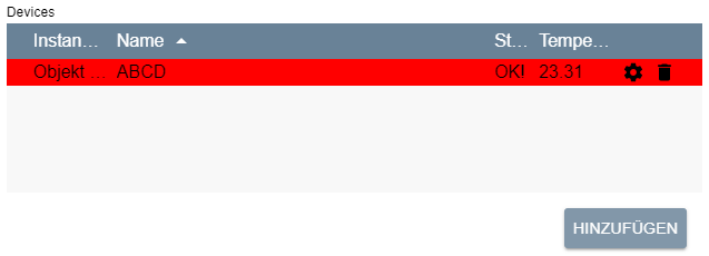
Example
// Simple editable list of instances and associated values
// The list initially contains an entry
{
    "type": "List",
    "name": "Devices",
    "caption": "Devices",
    "rowCount": 5,
    "add": true,
    "delete": true,
    "sort": {
        "column": "Name",
        "direction": "ascending"
    },
    "columns": [{
        "caption": "InstanceID",
        "name": "InstanceID",
        "width": "75px",
        "add": 0,
        "edit": {
            "type": "SelectInstance"
        }
    }, {
        "caption": "Name",
        "name": "Name",
        "width": "auto",
        "add": ""
    }, {
        "caption": "State",
        "name": "State",
        "width": "40px",
        "add": "New!"
    }, {
        "caption": "Temperature",
        "name": "Temperature",
        "width": "75px",
        "add": 20.0,
        "edit": {
            "type": "NumberSpinner",
            "digits": 2
        }
    }],
    "values": [{
        "InstanceID": 12435,
        "Name": "ABCD",
        "State": "OK!",
        "Temperature": 23.31,
        "rowColor": "#ff0000" //rot
    }]
}
If the value InstanceID of the first entry in the example table is changed to 54321 and Temperature to 37.0 and the table is saved, the new values for InstanceID and Temperature are persistently saved as module properties. Since the other elements, i.e. name, state and the color of the line rowColor, cannot be edited, they are not saved either.
If the table is now reloaded, the saved values for InstanceID and Temperature are loaded first. The non-editable fields name and state are then assigned the values from values i.e., "ABCD" and "OK!" filled. The color is also loaded from values, which gives the line a red background.
If one has also added another line to the table and set the values InstanceID and Temperature to 314 and -5.3, respectively, then these would also be loaded from the module properties. Since there is only one element in values, the non-editable fields are filled according to the standard values from add. The name field of the second line would remain empty and state would be set to "OK!". Since no color is defined, the background of this line would be transparent.
// List with alternative sorting
{
    "type": "List",
    "name": "sortList",
    "rowCount": 5,
    "add": false,
    "columns": [
        {
            "caption": "Text",
            "name": "Text",
            "width": "auto",
            "sortColumn": "Number"
        },
        {
            "caption": "Number",
            "name": "Number",
            "width": "200px",
            "visible": false
        }
    ],
    "values": [
        {
            "Text": "One",
            "Number": "1"
        },
        {
            "Text": "Two",
            "Number": "2"
        },
        {
            "Text": "Three",
            "Number": "3"
        }
    ]
}